| Image |
Comment |
| 07/25/2007 09:30:16 PM |
|
 Photographer found comment helpful. Photographer found comment helpful. |
| 07/25/2007 06:57:40 PM |
|
| Photographer found comment helpful. |
| 07/25/2007 04:35:57 PM |
Tilesby SaswaaComment by HeiSch: a few things I don't understand: your cropping (cutting off one corner of the square, but leaving a lot of space on the left side), the angle of your picture (the borders are not parallel to anything), choice of DOF (the front part is out of focus), lighting (there is light on one corner of the square highlighting this corner which is out of focus). This object IMHO screams for a perfectly centered composition, evenly focused and lit. |
| Photographer found comment helpful. |
| 07/25/2007 03:41:00 PM |
Final Faceless Expressionby SaswaaComment by beefykoala: What's with all the blood in this challenge!?
I like the Kill Bill trick of going b+w to maximise the strength of the image without overkilling with all the red. |
| Photographer found comment helpful. |
| 07/25/2007 01:50:35 PM |
|
| Photographer found comment helpful. |
| 07/25/2007 01:29:48 AM |
|
| Photographer found comment helpful. |
| 07/23/2007 02:23:47 PM |
Tilesby SaswaaComment by trevytrev: The lighting seems a bit unbalanced, bright in the lower frame and dark in the upper part. |
| Photographer found comment helpful. |
| 07/23/2007 01:32:30 AM |
|
| Photographer found comment helpful. |
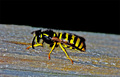
| 07/16/2007 02:40:29 AM |
Nightmare of the Hornetby SaswaaComment by taterbug: Good subject, and detail is not bad on the hornet. Seems like very harsh lighting though, and the yellows look way over saturated. Another thing that may help is to get the subject out of the center of the frame in this case. The centered comp here just feels very static and lifeless. |
| Photographer found comment helpful. |
| 07/13/2007 05:16:26 PM |
|
| Photographer found comment helpful. |
Home -
Challenges -
Community -
League -
Photos -
Cameras -
Lenses -
Learn -
Help -
Terms of Use -
Privacy -
Top ^
DPChallenge, and website content and design, Copyright © 2001-2025 Challenging Technologies, LLC.
All digital photo copyrights belong to the photographers and may not be used without permission.
Current Server Time: 04/21/2025 05:59:18 AM EDT.