| Image |
Comment |
| 07/13/2005 03:41:47 AM |
Glasshouse Plazaby FirstyComment by briphoto: Maybe it's me, I just don't like the angle of this photo. I'd have to be outside that building walking around it to see how it could be different. |
 Photographer found comment helpful. Photographer found comment helpful. |
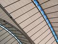
| 07/13/2005 03:39:18 AM |
roof-640.jpgby FirstyComment by briphoto: I like this one better than the other. Great abstract look, at times it doesn't even look real to me, but more like an "artists rendition" of some kind. |
| Photographer found comment helpful. |
| 07/12/2005 09:17:33 PM |
Glasshouse Plazaby FirstyComment by dragonlady: I like the colors a lot; also the way you angled the picture creates a lot of interest...it has a nice flowing color quality to it. |
| Photographer found comment helpful. |
| 07/12/2005 05:44:42 PM |
|
| Photographer found comment helpful. |
| 07/12/2005 07:03:00 AM |
Glasshouse Plazaby FirstyComment by banmorn: Heck this didn't do that bad. You sure as heck beat mine. Great blues in this. I like the perspective of the lines widening from top to bottom and the great rich blues in it as well. I also like the repitition of the the silver squares in the dark lines. The angle is good. How much more of there is the cylindrical area to the left? I there is more, I'm wondering how this would look with that on upper right angle totally and the flat area on the lower left angle with out the vertical area that is now on the upper left? Great stuff any which way you look at it. |
| Photographer found comment helpful. |
| 07/12/2005 06:55:34 AM |
roof-640.jpgby FirstyComment by banmorn: I think I agree with Anders' assessment that this would have done well in the challenge. The exposure is really fine. I do not know the edifice that you shot, but I might have gone with including more of the curve in the lower left corner. The lines of the straight part are very good and strong and I think with less of them and more of the curve area you would have had some stronger shape contrasts. Really loving the great lines of blue breaking up the earthtones in this. Oh the curve area has some distorted linear reflections in it that would be more evident with more of the curve, I think. Cool! |
| Photographer found comment helpful. |
| 07/12/2005 12:42:55 AM |
|
| Photographer found comment helpful. |
| 07/12/2005 12:42:17 AM |
|
| Photographer found comment helpful. |
| 07/11/2005 11:49:50 PM |
|
| Photographer found comment helpful. |
| 07/11/2005 09:30:25 PM |
Alice2.jpgby FirstyComment by sfalice: That lightening at the base helps quite a bit. I like it. Now, the lone white light standard in the middle sticks out like a sore thumb. Probably, now I'd think about cloning it out.
You're in Sidney. Hope you show us some views of the Opera House. All those spectacular lines! |
| Photographer found comment helpful. |
Home -
Challenges -
Community -
League -
Photos -
Cameras -
Lenses -
Learn -
Help -
Terms of Use -
Privacy -
Top ^
DPChallenge, and website content and design, Copyright © 2001-2025 Challenging Technologies, LLC.
All digital photo copyrights belong to the photographers and may not be used without permission.
Current Server Time: 04/24/2025 10:54:43 AM EDT.