| Image |
Comment |
| 08/12/2002 12:26:00 PM |
|
| 08/10/2002 07:49:00 PM |
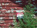
unsafeby jbolingComment by jimmsp: Something old. Use your photographic technique to emphasize the age of your subject. Composition - good Technical Aspects - good Meets Challenge - maybe. Don't confuse old with unkept Visual Impact / Originality - good |
| 08/09/2002 05:12:00 PM |
unsafeby jbolingComment by RedRuthann: Good use of lines...the diagonal shadow, the lines of the siding, the tree also gives a diagonal line. (I'm being frank - not to offend) As I look at this, the brightness of the sign is distracting. I feel as if there should be something else - as if part of a story has been left out. The image is not 'speaking to me'. 7 Ruthann |
| 08/09/2002 05:42:00 AM |
unsafeby jbolingComment by UberFish: The peeling paint needs to be alot sharper. Its probably been blurred by your picture editor, rather than by the camera. |
| 08/08/2002 08:55:00 AM |
unsafeby jbolingComment by jsabbarton: Sorry to score so low, but I am really not sure of the picture overall. It seems to me to be lacking in content. But, I'm just one voter and I hope others have better eyes than I� |
| 08/06/2002 10:46:00 PM |
unsafeby jbolingComment by jmsetzler: interesting concept... I would like to see less of the greenery and more of the wall in this composition... good work :) - jmsetzler |
| 08/06/2002 02:59:00 PM |
unsafeby jbolingComment by karmat: Very nice use of contrasting colors, and I like how the tree gives it some balanced. It just seems a little soft on the focus, and I think a sharper focus would have really made the sign jump out. Good job, though. karmat |
| 08/06/2002 12:29:00 PM |
unsafeby jbolingComment by LanSnake: I love the texture of the building. I might like the composition a bit more if the sign were closer, and maybe not so near the center of the photo (move to the lower right?). The photo could also be improved with a small amount of sharpening in Photoshop. Overall, nice work! |
| 08/06/2002 07:38:00 AM |
unsafeby jbolingComment by annelizabeth: I think this would have worked equally as well without the sign - the contrast between the plant and the tattered siding would have been enough to signify age to me. That said, I guess you couldn't get close enough to remove it for the photo. |
| 08/05/2002 09:07:00 PM |
|
Home -
Challenges -
Community -
League -
Photos -
Cameras -
Lenses -
Learn -
Help -
Terms of Use -
Privacy -
Top ^
DPChallenge, and website content and design, Copyright © 2001-2025 Challenging Technologies, LLC.
All digital photo copyrights belong to the photographers and may not be used without permission.
Current Server Time: 03/15/2025 01:56:52 PM EDT.