| Image |
Comment |
| 12/27/2005 03:14:18 PM |
|
 Photographer found comment helpful. Photographer found comment helpful. |
| 12/25/2005 03:32:29 AM |
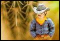
The Lonerby kyeboshComment by batmaing: I don't find the subject interesting enough to help pull the image together. Although the DOF is well done, the background and the subject are unrelated so it's hard for me to feel anything for the image. |
| Photographer found comment helpful. |
| 12/22/2005 04:04:55 PM |
The Lonerby kyeboshComment by GrayGhost: One of the better figurine shots, good composition and colors. Your photo really shows off shallow DOF - I love the star-like cactus geometry and the whole image. |
| Photographer found comment helpful. |
| 12/22/2005 01:40:18 PM |
|
| Photographer found comment helpful. |
| 12/22/2005 09:13:02 AM |
The Lonerby kyeboshComment by UNTITLED: Excellent choice of using the cactus as the blurred background. The blurred shapes of the spines is cool. Great work! |
| Photographer found comment helpful. |
| 12/22/2005 12:50:42 AM |
|
| Photographer found comment helpful. |
| 12/21/2005 06:31:01 PM |
The Lonerby kyeboshComment by _eug: There is such a thing as too little Depth of Field. This is one such case. |
| Photographer found comment helpful. |
| 12/21/2005 08:37:43 AM |
The Lonerby kyeboshComment by macrothing: 5 - Unusual. Criticism; wish it were 640, the colors are good, unusual focal points and background, not sure on the thickish frame at this size. Like it. Perhaps 'taller' as well may have given this something more, with a little more space above &/or below the 'loner'. |
| Photographer found comment helpful. |
| 11/27/2005 12:36:36 AM |
No Titleby kyeboshComment by loseme: *Critique Club*
Cool idea, I like the college look. One thing that was interesting I find is how the border really makes his shirt and book look gray, was it a black shirt? I also wish the book was down just a couple more inches to see his face. I really like the include of the leaves it really gives you that "at school feel". I love how you took the time to make sure the bench look like it is connected and not 3 separate shots. I personally scored you higher then you placed. Good job.
|
| Photographer found comment helpful. |
| 11/25/2005 11:11:56 PM |
|
| Photographer found comment helpful. |
Home -
Challenges -
Community -
League -
Photos -
Cameras -
Lenses -
Learn -
Help -
Terms of Use -
Privacy -
Top ^
DPChallenge, and website content and design, Copyright © 2001-2025 Challenging Technologies, LLC.
All digital photo copyrights belong to the photographers and may not be used without permission.
Current Server Time: 04/15/2025 01:18:17 AM EDT.