| Image |
Comment |
| 11/08/2004 11:33:47 AM |
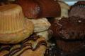
Julyby brandykComment by giega: If you have increased the saturation it would make quite a difference. Well fitted for July. |
| 11/08/2004 09:02:27 AM |
Choicesby brandykComment by wtowers: This doesn't have impact on me, furry at the edges and in the middle, more DOF and a little more contrast would make a big improvement on this subject |
| 11/06/2004 05:15:21 PM |
Choicesby brandykComment by Pooba: Too dark. Image also feels cluttered to me. Maybe fewer "goodies" and more detail would help. |
| 11/06/2004 09:11:17 AM |
Choicesby brandykComment by hyphaefungi: Picture is a bit too dark, and the focus is somewhere I can't even point out. I definitely see the indecision though. |
| 11/05/2004 12:53:51 PM |
|
| 11/04/2004 10:12:30 PM |
|
| 11/04/2004 05:17:02 PM |
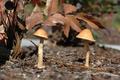
Two Little Shroomsby brandykComment by taterbug: Good concept. Looks like possibly some nice texture in this shot. Seems like focus could be sharper, hard to tell with being so small. You should use the full 640 allowed, it will show much more detail and will bring higher scores. There are tutorials on the site about sizing when submitting photos if you need it. |
| 11/04/2004 09:25:55 AM |
Choicesby brandykComment by Tiberius: Too crowded and a little out of focus. Lightning is also something that ca be improved a lot |
| 11/04/2004 12:09:35 AM |
|
| 11/03/2004 04:06:19 PM |
Choicesby brandykComment by Gil P: a decent concept but the lighting and contrasts are to soft. |
Home -
Challenges -
Community -
League -
Photos -
Cameras -
Lenses -
Learn -
Help -
Terms of Use -
Privacy -
Top ^
DPChallenge, and website content and design, Copyright © 2001-2025 Challenging Technologies, LLC.
All digital photo copyrights belong to the photographers and may not be used without permission.
Current Server Time: 03/12/2025 09:04:17 PM EDT.