| Image |
Comment |
| 08/19/2002 07:21:00 PM |
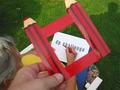
Frame itby zacowacoComment by Gracious: Meets Challenge Theme:yes Technical :fine Composition:fair Creativity:fair Visual Appeal to me:fair Remarks:good use of color Grayce...aka...Gracious |
| 08/18/2002 05:10:00 PM |
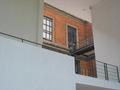
Extensionby zacowacoComment by Gracious: I love the warm tones of the brick here, and the contrast of the white walls is good. Even has some nice strong lines. I'd like to have seen it cropped more tightly around the brick...since I like brick. With all that white wall, the brick still shows some detail..no ez task! |
| 08/17/2002 11:01:00 AM |
Extensionby zacowacoComment by jmsetzler: This is an interesting mix of old / new architecture... the 'newness' of it doesn't really jump out at me though... - jmsetzler |
| 08/16/2002 12:36:00 PM |
|
| 08/15/2002 05:11:00 PM |
Extensionby zacowacoComment by mjcecil: There is something missing here. Perhaps contrast. I like the subject VERY much, though. Good geometry, and thematic contrast. |
| 08/15/2002 04:13:00 PM |
Extensionby zacowacoComment by justine: Looks a bit OOF to my eye, but I really like this. All these lines, angles. Nice work. Score-6 Kee |
| 08/15/2002 12:31:00 PM |
Extensionby zacowacoComment by HBunch: To me, this is visually unapealing. with all the flat white, the focus seems to be the dark part of the building. that's where my eyes are drawn, to the dark part of the building, and that part looks very old. however, in comparison, the dark part makes the white part look new, which is what I think was the message you were trying to come across with. however, being as that my eyes are firstly drawn to the old part of the building, that's what I see first and the image I get is old, not new. |
| 08/15/2002 11:47:00 AM |
Extensionby zacowacoComment by goodtimecharlee: very cool compostion. i love all the geometric lines and shapes going on. if you could pull some of the cyan or blue out of the walls and bring to a more pure white and then saturate those red bricks this could have much more impact. good eye. keep it up. |
| 08/15/2002 12:55:00 AM |
|
| 08/13/2002 10:25:00 PM |
Extensionby zacowacoComment by jimmsp: Something new. Composition - pretty good Technical Aspects - pretty good. Meets Challenge - yes Visual Impact / Originality – good Jim msp |
Home -
Challenges -
Community -
League -
Photos -
Cameras -
Lenses -
Learn -
Help -
Terms of Use -
Privacy -
Top ^
DPChallenge, and website content and design, Copyright © 2001-2025 Challenging Technologies, LLC.
All digital photo copyrights belong to the photographers and may not be used without permission.
Current Server Time: 03/13/2025 03:20:44 AM EDT.