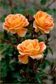
August - Peridotby
dartompkinsComment by HBunch: *Critique Club*
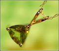
The first thing that stands out to me is the small spot of "stem" that is out of focus. Was this selectively blurred? The focus seems odd in some places. Focus on the stone is also soft. I'm thinking though that because the background shows through the stone, that it appears soft because of that.
The orange reflections in the gold are distracting to me. Gold isn't suposed to be orange, it's suposed to be gold, and seeing it as orange makes me thing that it's not right, which then I wouldn't buy it.
There is also a light reflection in the upper part of the 'stem'. Looks like flash or strong overhead light. That distracts a bit as well.
I like the angle and framing/cropping. The way that the necklace sits in the photo is appealing and adds interest to the photo.
I like the background color, but maybe not with the color of the stone being so similar. Not sure about that. Would have to see it different colors to see which I would prefer, but I haven't decided weather I like the combo or not. Maybe it was the best choice with the green stone. *shrug*
Overall nice shot which in my opinion would benefit from different focus options and lighting.
~Heather~
Edit to add that when I viewed this as a thumbnail, the colors seemed to work out just fine. The odd focus issues were not as visible either. This did make for a more visually appealing image, so I made my mind up that the background color is good, but it just needs different focus and lighting (to reduce the orange glare).
Message edited by author 2005-05-07 16:15:50.