| Image |
Comment |
| 08/16/2002 04:16:00 PM |
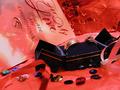
Hopes and Dreamsby NitenComment by tee tah: concept of rings is good, but too much red distracts from the rings... I lose focus on the rings. Also I find the foreground looks blurry... again distracting. I would crop in close on those rings, get great detail there, and let the picture tell the story rather than the title. |
 Photographer found comment helpful. Photographer found comment helpful. |
| 08/16/2002 10:41:00 AM |
Hopes and Dreamsby NitenComment by Gracious: I don't get all the sequints....how do they fit in? Rings could be better focused. This has lots of potential...good subject. Needs work. |
| Photographer found comment helpful. |
| 08/15/2002 07:41:00 PM |
Hopes and Dreamsby NitenComment by Swashbuckler: This one is kinda scary.....O.K. newly married couple challenge? Suggestion: try to limit yourself to hopes or dreams (a small joke), seriously, I think there are tooo many items in this shot. Keep the rings (but display them so we can see more of the ladies ring, it disappears at the edge of the box); select one more item, let's say the card, throw out the rest as too busy (O.K. leave the ribbon, too....) 7 Swash |
| Photographer found comment helpful. |
| 08/15/2002 02:41:00 PM |
Hopes and Dreamsby NitenComment by HBunch: This is pleasing to look at. Looks like an ad that would be in a magazine. However, the card seems to be in better focus than the rings. Still a really great photo. Great job and good luck in the challenge. |
| Photographer found comment helpful. |
| 08/15/2002 11:34:00 AM |
Hopes and Dreamsby NitenComment by jsabbarton: I really like the colours in the picture; they give a warm romantic glow. While the composition seems a little busy, the overall shot is good, but I can't help feeling that the challenge target hasn't be hit too well. Exposure and technical merit are very good� Not the best judgement, sorry to be negative� |
| Photographer found comment helpful. |
| 08/14/2002 03:51:00 PM |
Hopes and Dreamsby NitenComment by notashamd: Of course, "Weddings" aren't very creative, but I really like the colors, and the lighting. This is creative. 8 |
| Photographer found comment helpful. |
| 08/13/2002 10:14:00 PM |
Hopes and Dreamsby NitenComment by titotapado: Reminds me of the picture of the Fear challenge "Fear of Commitment"; but that might just be a coincidence. It looks nicely decorated, but I don't think the colors mix very well. The rings are not very clearly visible... |
| Photographer found comment helpful. |
| 08/13/2002 10:04:00 PM |
Hopes and Dreamsby NitenComment by jimmsp: Something new. Composition - pretty good. The rings could be shown better, in my opinion Technical Aspects - pretty good. Meets Challenge - yes Visual Impact / Originality � pretty good Jim msp |
| Photographer found comment helpful. |
| 08/13/2002 05:51:00 PM |
Hopes and Dreamsby NitenComment by Kavey: Interesting jumble, kind of representative of newly married life perhaps. Toooooo red. 5, Kavey |
| Photographer found comment helpful. |
| 08/13/2002 03:13:00 PM |
|
| Photographer found comment helpful. |
Home -
Challenges -
Community -
League -
Photos -
Cameras -
Lenses -
Learn -
Help -
Terms of Use -
Privacy -
Top ^
DPChallenge, and website content and design, Copyright © 2001-2025 Challenging Technologies, LLC.
All digital photo copyrights belong to the photographers and may not be used without permission.
Current Server Time: 04/11/2025 06:56:27 AM EDT.