| Image |
Comment |
| 05/04/2005 12:45:08 AM |
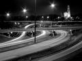
Night Trafficby jduffettComment by papa: Black & white was a great choice for this shot. The church/cathedral looks like a double exposure. |
 Photographer found comment helpful. Photographer found comment helpful. |
| 05/01/2005 08:22:56 PM |
|
| Photographer found comment helpful. |
| 02/14/2005 10:06:48 PM |
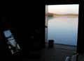
Mirrorby jduffettComment by srbrubaker: Very nice shot. The water is pretty; the light in this space is strongly atmospheric. Actually, it would be too dark, if it were not for the mirror. The mirror redeems everything. |
| Photographer found comment helpful. |
| 02/14/2005 10:02:01 PM |
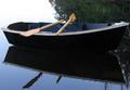
Row Boatby jduffettComment by srbrubaker: Simple, clean, uncluttered. I like the way the fog blurs the margin between sky and water. I also like the tight composition, no space wasted.
Black is a tough color for a subject. The inside of the boat shows detail, and I think the stern of the boat does as well. But most of the hull does not. Such photographic 'blank space' will frequently suck the life out of a photo. What is interesting and a little distracting is that the reflection of the black surface in the water appears to allow us to see below the surface all the way to the bottom. But, frustratingly, there's not much to see there and our efforts seem wasted. This doubles this blank space, and now almost half of the photo is rendered uninteresting - the eye circles the picture in the margins.
In any case, it's good photo.
|
| Photographer found comment helpful. |
| 02/04/2005 03:52:37 PM |
|
| Photographer found comment helpful. |
| 01/31/2005 10:40:22 PM |
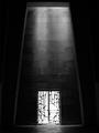
Unsettled Weatherby jduffettComment by Brad: Composition is great and tones/use of B&W a good choice. Blown-out section on top (white) really hurts this image in my opinon. ((5)) |
| Photographer found comment helpful. |
| 01/31/2005 12:35:18 PM |
|
| Photographer found comment helpful. |
| 01/27/2005 06:15:33 PM |
|
| Photographer found comment helpful. |
| 01/24/2005 05:41:46 AM |
Unsettled Weatherby jduffettComment by Skip: while i appreciate you effort here, i think your image could use some work. the bottom half is nice and tight, but the top is completely blown out. if it is on purpose, i'll admit, i'm not getting it. if this is not intentional, then please don't take it personally if you are not getting the scores and comments you expected. this is a tough challenge, especially in its size, and to do well, you need to connect with the viewers both technically and aesthetically. good luck! |
| Photographer found comment helpful. |
| 01/24/2005 03:07:53 AM |
|
Home -
Challenges -
Community -
League -
Photos -
Cameras -
Lenses -
Learn -
Help -
Terms of Use -
Privacy -
Top ^
DPChallenge, and website content and design, Copyright © 2001-2025 Challenging Technologies, LLC.
All digital photo copyrights belong to the photographers and may not be used without permission.
Current Server Time: 04/21/2025 06:18:14 AM EDT.