| Image |
Comment |
| 05/08/2006 09:57:30 PM |
Essence of Indiaby DigiFotoBuddyComment by yanko: Greetings from your own critique club.
First Impression:
Looks professional.
Composition:
Very good. The space is filled well and with purpose. Not much more I can say other than well done.
Subject:
She looks relaxed and comfortable, something that is often missing with a lot of other portraits I've seen at DPC. Again, well done in accomplishing that.
Technical (Colour and light):
The lighting is very good. The detail is captured without any harsh transitions. The light on the hair is sufficient. However for DPC purposes you might want to have a bit more contrast so those without calibrated monitors won't ding you because it looks too dark. That one area of the hair with the brighter light does seem out of place but it's not distracting to me.
Improvement:
I really don't have any. As I mentioned above, for DPC purposes maybe brighten the hair more so that it's more visible across the board for everyone.
Summary:
Great image. I thought it was one of the best in the challenge and really I should be asking you about portrait shots rather than me critiquing yours. :)
Good luck on future challenges although I don't think you really need it.
Edited to fix spelling. Message edited by author 2006-05-08 21:59:22. |
 Photographer found comment helpful. Photographer found comment helpful. |
| 05/08/2006 08:51:28 PM |
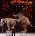
The Circus in townby DigiFotoBuddyComment by Rebecca: Greetings!
This isn't a bad shot for a small town newspaper. The elephants are in a good pose. I think this would be nice with a tighter crop to just the lower 2/3 of the photo, eliminating the too-dark background. We don't need to see the circus logo to know what's going on. Focus on the elephants. This will also help us to see the trainer, who currently is so small in the photo that he gets lost amongst their legs. I also wonder if a little sharpening might help? |
| Photographer found comment helpful. |
| 05/08/2006 04:33:00 PM |
|
| Photographer found comment helpful. |
| 05/08/2006 02:47:53 PM |
The Circus in townby DigiFotoBuddyComment by Gunnsi: Comment from a member of your own commenting club :-)
A well deserved "over 6" score.
Plus:
1. This picture is in good focus
2. Lighting on the elephants skin is good
3. The "blue guys" in the back are well placed
Minus:
1. IMO it would be better to crop differently. Crop below the band playing or over the sign. Also show a bit more of the bottom. More likely you didnt get it all in the picture. So you should maybe had to take the picture portrature.
2. Lighting on the left elephant "blue sign" is a bit to harsh. You could have darkened it a bit.
3. The wire in the top right corner distracts and would have been nice to clone it away. Message edited by author 2006-05-10 20:24:21. |
| Photographer found comment helpful. |
| 05/08/2006 09:32:27 AM |
The Circus in townby DigiFotoBuddyComment by alexgarcia: really wonderful.
Like the composition, very dynamic and the crop is OK.
The colors and white balance is great, in a dificult conditions, I guess. The sharpness is good.
The subject is funny, you captured the moment very well and you include all the important things in the shot.
To improve: sorry, but I can't think of anything. like it this way.
Well done.
�lex |
| Photographer found comment helpful. |
| 05/08/2006 01:54:58 AM |
The Circus in townby DigiFotoBuddyComment by margiemu: This is a great shot... makes me want to go to the circus!
compostion: If you had panned out just slightly so that the crop wasn't so tight, I think it might have looked a bit better. As is the feet of the trainer are cut off, and the elephants look slightly off balance.
suject: this is great. You caught the elephants at a great moment.
technical: I'm sure the lighting was tricky, and this turned out pretty well. I know nothing about PS, so I can't make any comments about post processing.
This shot does a great job of capturing the 'essence' of the circus, which is what photojournalism should do. |
| Photographer found comment helpful. |
| 05/07/2006 10:40:13 PM |
|
| Photographer found comment helpful. |
| 05/07/2006 10:02:12 PM |
|
| Photographer found comment helpful. |
| 05/07/2006 07:38:45 PM |
|
| Photographer found comment helpful. |
| 05/07/2006 04:38:10 PM |
2by DigiFotoBuddyComment by Jutilda: I think I like this one better. Close and the tones are so rich. WOW - those dark ones are almost black! Beautiful. |
| Photographer found comment helpful. |
Home -
Challenges -
Community -
League -
Photos -
Cameras -
Lenses -
Learn -
Help -
Terms of Use -
Privacy -
Top ^
DPChallenge, and website content and design, Copyright © 2001-2025 Challenging Technologies, LLC.
All digital photo copyrights belong to the photographers and may not be used without permission.
Current Server Time: 04/22/2025 10:08:47 PM EDT.