| Image |
Comment |
| 04/20/2006 07:30:41 AM |
|
| 04/20/2006 02:26:15 AM |
|
 Photographer found comment helpful. Photographer found comment helpful. |
| 04/20/2006 02:19:43 AM |
|
| Photographer found comment helpful. |
| 04/19/2006 03:25:45 PM |
|
| Photographer found comment helpful. |
| 04/19/2006 09:03:46 AM |
|
| Photographer found comment helpful. |
| 04/19/2006 06:53:57 AM |
|
| Photographer found comment helpful. |
| 04/19/2006 03:04:22 AM |
Insurgent (focal length - 300 mm)by DigiFotoBuddyComment by puzzled: Hey Shail :-) This has some really cool tones, so I think the b&w part of your post-processing was a big hit - well done! I can't believe how mean some people are with the comments. I agree that you went too far with the noise reduction and I would've made that comment had I voted on Candid. But I wish people would give criticism in a slightly less sarcastic way. Anyway, great job with the b&w, super title, nice capture. Just for fun, maybe you could try reprocessing without the NI and see how it looks. The composition is brilliant. |
| Photographer found comment helpful. |
| 04/19/2006 02:52:51 AM |
Refraction, eh?by DigiFotoBuddyComment by Pedro: 25th is a very respectable placement. the only downside to this one is in the processing - it's a little oversaturated, and either the compression or the sharpening has caused some artifacts and disturbed the clean lines that make this image. I would bet that the full sized version looks spectacular.
a couple of things to avoid this (and you may know this already, but I don't know how familiar you are with photoshop, so bear with me if this is old news):
1. sharpen your image last - AFTER resizing
2. when you resize, use 'bicubic sharper' as your compression algorhythm (in CS and CS2) or use the stair interpolation method (gradual 10% decreases in size rather than one big drop)
3. make sure your colour space is set to sRGB when editing, as that's what viewers see on the web.
the only other thing that throws me off in this one is the horizon - neither the table nor the glasses seem level.
otherwise the concept is perfect for the challenge, and the setup is very clean and pleasing to look at. very solid entry.
P |
| Photographer found comment helpful. |
| 04/19/2006 02:43:03 AM |
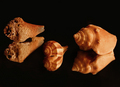
Naturally Texturedby DigiFotoBuddyComment by Pedro: A universal truth about entering challenges on DP that you have to deal with, is that voters have 2-300 other images to see before finishing their voting (or more). In order to score well, the image has to have an immediate impact on the voter, or they're already thinking about the next image, or the last one that impacted them.
In this case, you have a very techically competent photo. The setup is very nice, but maybe a little bit linear. shifting the middle shell to add some depth wouldn't hurt. the lighting is sopt on, as is the colour and sharpness. What it doesn't do is SCREAM texture, and that's what the voter is asked to judge. An extreme closeup of the left shell would have more impact in that it's full of texture. The lighting you have used would highlight that, and you could easily have created a palpable texture.
Photographic integrity is certainly important in these challenges, but equally important is creativity and relevant challenge impact.
Keep at it my friend, you have the skills to score well...now you just need to let your brain roam free and see where it takes you :)
Regards,
pedro |
| Photographer found comment helpful. |
| 04/19/2006 02:28:41 AM |
|
| Photographer found comment helpful. |
Home -
Challenges -
Community -
League -
Photos -
Cameras -
Lenses -
Learn -
Help -
Terms of Use -
Privacy -
Top ^
DPChallenge, and website content and design, Copyright © 2001-2025 Challenging Technologies, LLC.
All digital photo copyrights belong to the photographers and may not be used without permission.
Current Server Time: 04/21/2025 10:23:06 PM EDT.