| Image |
Comment |
| 02/11/2005 03:42:39 PM |
MissSessa.JPGby HBunchComment by Marjo: You did a great job on this! Nice sharp details, great composition and the black and white is a perfect choice. |
 Photographer found comment helpful. Photographer found comment helpful. |
| 01/09/2005 03:47:13 AM |
|
| 11/06/2004 07:41:23 AM |
Portraitby HBunchComment by Philos: I realy don't know if I like this or not.
It's a bit sexy, but she looks a bit bored, it looks like she has paint on her skin...
The stray hairs make her look careless about herself, the pov is confusing the shalow dof is not helping but I still come again and again to look at her...
Don't know why.. |
| Photographer found comment helpful. |
| 11/05/2004 05:59:53 PM |
Portraitby HBunchComment by Dr.Confuser: I've spent a lot of time looking at this. There's a lot going on here that conveys emotional impact. Why this partiucular location? Why the camo's? Hair looks wet, why? Shirt open, why? Attitude inthe eyes, what are they telling me? The whole thing looks like trouble and it's the unanswered questions that hold my interest.
Having said all that, it's propbably a pretty risky image for this forum. In this land of kittens and flowers, I fear this won't do well. I'm personally glad you took the risk. Keep shooting! |
| Photographer found comment helpful. |
| 11/05/2004 02:01:55 PM |
Portraitby HBunchComment by Kylie: Too casual and out of focus for me to score well; you hit the eyes well, and the pose could be done in a very interesting way, but I feel that the photo is too candid and unfinished to do well in a challenge. |
| Photographer found comment helpful. |
| 11/04/2004 09:22:03 PM |
Portraitby HBunchComment by graphicfunk: Returning for comments.
A very good study with a quizzical facial expression. The hair is perfect over the face and the suggested swil of the background is just great. A funny thing: when I clocked on this image my screen showed only the top. Cropped right at the sleeve. I really liked it like that. When I scrolled it into position I then noticed a part of the thumb joint showing and the fading of the light on the left arm past the joint. It is my feeling that such a crop would serve the image better. Bumping up.
|
| Photographer found comment helpful. |
| 10/31/2004 04:19:36 PM |
|
| Photographer found comment helpful. |
| 10/30/2004 03:05:51 AM |
|
| Photographer found comment helpful. |
| 10/28/2004 06:37:17 AM |
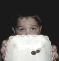
Got Change?by HBunchComment by ridvanerkan: i think idea is wonderful. But i dont like execution. upper surface of the plate is overexposed. |
| Photographer found comment helpful. |
| 10/27/2004 11:26:07 AM |
Got Change?by HBunchComment by dovey: The big bowl is too over powering and dominates the photo. Which is a shame because the little boy has such sad eyes. |
| Photographer found comment helpful. |
Home -
Challenges -
Community -
League -
Photos -
Cameras -
Lenses -
Learn -
Help -
Terms of Use -
Privacy -
Top ^
DPChallenge, and website content and design, Copyright © 2001-2025 Challenging Technologies, LLC.
All digital photo copyrights belong to the photographers and may not be used without permission.
Current Server Time: 04/16/2025 06:18:24 AM EDT.