| Image |
Comment |
| 06/05/2007 12:26:40 AM |
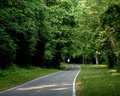
Running Religiouslyby swagmanComment by chip_k: With the runner as your subject, he really should be larger and in better focus. Small subjects CAN work and it helps that yours stands out with his white shirt, but in those instances, the backdrop/environment is usually pretty dramatic.
Hope that helps with your next Challenge! |
| 06/02/2007 01:01:04 PM |
Running Religiouslyby swagmanComment by Zeus: Now that's more like it! Daily habits are performed religiously, and have nothing to do with belief in a supernatural entity. Great concept captured in a great photo! 8 |
 Photographer found comment helpful. Photographer found comment helpful. |
| 06/01/2007 10:45:46 AM |
|
| Photographer found comment helpful. |
| 05/31/2007 09:47:44 PM |
|
| Photographer found comment helpful. |
| 05/30/2007 08:07:55 AM |
|
| Photographer found comment helpful. |
| 04/29/2005 10:01:08 AM |
|
| 01/22/2005 08:18:53 PM |
Scary-Clown.jpgby swagmanComment by jpochard: Hehe...yeah, I thought this guy was a little creepy lookin. Probably couldn't even tell what he is unless seen in person. |
| 01/09/2005 02:39:39 AM |
Less Coffee. More Bailey's.by swagmanComment by Bear_Music: *** CRITIQUE CLUB COMMENT ***
Rich tonalities are attractive. Composition is a little static to be truly engrossing, split as it is into such a nearly symmetrical opposition of halves. Image suffers from blocking up in the shadows; more care with the lighting would have given richer dark areas and more wow factor. The s-curve upper left is attractive, but I keep wanting to read it as the shoulder of the bottle and it seems at odds with the hilit right shoulder of the same bottle. Falloff of light on the word "Baileys" is a little offputting to me, as is the asymmetrical distortion of the arch of this label.
Robt.
And, Swagman my friend, this was a random draw :-) |
| 01/07/2005 09:25:03 AM |
|
| Photographer found comment helpful. |
| 01/02/2005 03:44:56 PM |
|
| Photographer found comment helpful. |
Home -
Challenges -
Community -
League -
Photos -
Cameras -
Lenses -
Learn -
Help -
Terms of Use -
Privacy -
Top ^
DPChallenge, and website content and design, Copyright © 2001-2025 Challenging Technologies, LLC.
All digital photo copyrights belong to the photographers and may not be used without permission.
Current Server Time: 03/12/2025 05:48:12 PM EDT.