| Image |
Comment |
| 09/15/2002 08:28:00 PM |
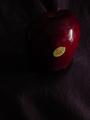
Appleby mrbillComment by johnson: This is very difficult for me to see b/c of the darkness.... |
| 09/15/2002 06:24:00 PM |
Appleby mrbillComment by TerryGee: I find this way too dark, and too much background...It makes the background in front of the apple almost look like the subject. |
| 09/15/2002 02:08:00 PM |
Appleby mrbillComment by jpoole: Image is too dark for my taste; and the two bright areas (label and highlight) compete for my attention. |
| 09/15/2002 06:24:00 AM |
|
| 09/14/2002 01:46:00 PM |
|
| 09/14/2002 01:35:00 PM |
Appleby mrbillComment by Yellowpeep: A little dark for my taste and I think the sticker distracts me a little. |
| 09/14/2002 01:33:00 PM |
Appleby mrbillComment by floyd: Good idea but just waaaay too dark for me. 6 - floyd |
| 09/14/2002 12:05:00 PM |
|
| 09/14/2002 11:21:00 AM |
Appleby mrbillComment by Gracious: On my monitor this is showing up very, very dark. Is this intentional? Also I think this would be nicer without the label, but it's personal taste. I'd score it higher without, and brightened up a bit. 5 Gracious aka Grayce |
| 09/14/2002 12:33:00 AM |
|
Home -
Challenges -
Community -
League -
Photos -
Cameras -
Lenses -
Learn -
Help -
Terms of Use -
Privacy -
Top ^
DPChallenge, and website content and design, Copyright © 2001-2025 Challenging Technologies, LLC.
All digital photo copyrights belong to the photographers and may not be used without permission.
Current Server Time: 03/14/2025 01:59:12 AM EDT.