| Author | Thread |
Comments Made During the Challenge  |
|
|
09/15/2002 08:28:00 PM |
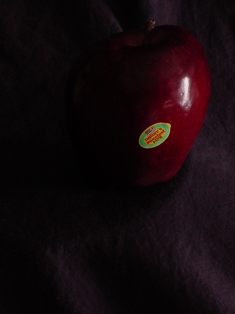
| This is very difficult for me to see b/c of the darkness.... |
|
|
|
09/15/2002 06:24:00 PM |
| I find this way too dark, and too much background...It makes the background in front of the apple almost look like the subject. |
|
|
|
09/15/2002 02:08:00 PM |
| Image is too dark for my taste; and the two bright areas (label and highlight) compete for my attention. |
|
|
|
09/15/2002 06:24:00 AM |
|
|
|
09/14/2002 01:46:00 PM |
|
|
|
09/14/2002 01:35:00 PM |
| A little dark for my taste and I think the sticker distracts me a little. |
|
|
|
09/14/2002 01:33:00 PM |
| Good idea but just waaaay too dark for me. 6 - floyd |
|
|
|
09/14/2002 12:05:00 PM |
|
|
|
09/14/2002 11:21:00 AM |
| On my monitor this is showing up very, very dark. Is this intentional? Also I think this would be nicer without the label, but it's personal taste. I'd score it higher without, and brightened up a bit. 5 Gracious aka Grayce |
|
|
|
09/14/2002 12:33:00 AM |
|
|
|
09/13/2002 08:28:00 PM |
| The apple is much too dark. |
|
|
|
09/13/2002 05:26:00 PM |
| I like that you can really only see the sticker on the apple... but the apple could probably be a little more visable. |
|
|
|
09/13/2002 02:03:00 PM |
| The part of the apple I see is very nice, what happened to the rest of the apple? The large amount of negative space.....I don't understand why. Good focus on the label, very clear. 7 Swash |
|
|
|
09/13/2002 10:41:00 AM |
| nice attempt, but it's just too dark. and the label is the main focus, which isn't very interesting. i'm also not a big fan of "negative space" style shots that place the subject near the top. it makes me feel like the top of the picture is missing, since the subject is "pointing" up, not down. (this placement works when the subject seems to be pointing down). a good effort, but definitely needs more light. |
|
|
|
09/13/2002 05:13:00 AM |
I like the darkness but just want a tiny tiny bit more light. Not enough to light the whole apple which would make it too boring but as it stands it's just too dark and undefined for me.
Kavey |
|
|
|
09/12/2002 03:52:00 PM |
|
|
|
09/11/2002 08:47:00 PM |
Composition: Subject Placement, Cropping, Background4,
Technical: Focus, Exposure, Lighting, Processing5,
Appeal: Is it Interesting, Motivating, Etc.? 5,
Total Averaged Rating5. Autool
|
|
|
|
09/11/2002 11:03:00 AM |
|
|
|
09/11/2002 08:59:00 AM |
| A little too dark, though I do understand the use of shadows in this photo. |
|
|
|
09/11/2002 05:44:00 AM |
| I like the atmosphere you have created, and the subject is clearly definable. However, whilst I assume this is intentional on your part, I do think it is just a little too dark. Good luck� (5) |
|
|
|
09/10/2002 11:10:00 PM |
| The photo seems too dark (It could be my monitor). |
|
|
|
09/10/2002 09:06:00 PM |
|
|
|
09/10/2002 07:39:00 PM |
| I had to recheck the calibration on my monitor, but even after adjusting it, this shot is very dark... The apple is nearly unrecognizable. |
|
|
|
09/10/2002 01:19:00 PM |
| the little sticker kills it |
|
|
|
09/09/2002 08:45:00 PM |
| this image is too dark to see, other than the sticker which pops out |
|
|
|
09/09/2002 07:03:00 PM |
| I'm sure I'm not going to be the only person to tell you that this seems a bit too dark. I would also think that the idea could have been better executed without the sticker. |
|
|
|
09/09/2002 03:02:00 PM |
| Negative space is this week :-) How many comments like this will you get ? Where V&F is concerned, it is a great picture. Very clever lighting if not too much so. It would have been nice to see more highlight of the stalk ?? |
|
|
|
09/09/2002 02:58:00 PM |
|
|
|
09/09/2002 02:57:00 PM |
| Way too dark.. you can barely see the apple. :( 5 |
|
|
|
09/09/2002 02:40:00 PM |
|
|
|
09/09/2002 02:39:00 PM |
| Nice study. I'll be really interested to see how this flies here. 7 Jak |
|
|
|
09/09/2002 01:32:00 PM |
|
|
|
09/09/2002 01:00:00 PM |
| Maybe it just my computer, but I can barely see this... I don't think I like the sticker in the shot |
|
|
|
09/09/2002 12:43:00 PM |
|
|
|
09/09/2002 12:40:00 PM |
| sorry, this image is way too dark on my monitor (and most of the others look ok, so i'm tempted to conclude your photo is actually very dark). all i can make out is the sticker, a little bit of the right side of the apple and the highlight from the lightsource. the rest is black. even if it was a little lighter, i wonder if a landscape format would've been nicer, or moving the apple down so that there's not so much empty space in the foreground. -- gr8photos. |
|
|
|
09/09/2002 11:51:00 AM |
|
|
|
09/09/2002 11:34:00 AM |
|
|
|
09/09/2002 11:05:00 AM |
| too dark i know you had your reason |
|
|
|
09/09/2002 01:34:00 AM |
| Very, Very dark. I'm sure you intended it this way but, it makes me want to squint to see it better. |
|
Home -
Challenges -
Community -
League -
Photos -
Cameras -
Lenses -
Learn -
Help -
Terms of Use -
Privacy -
Top ^
DPChallenge, and website content and design, Copyright © 2001-2025 Challenging Technologies, LLC.
All digital photo copyrights belong to the photographers and may not be used without permission.
Current Server Time: 03/13/2025 01:33:04 AM EDT.