| Image |
Comment |
| 04/25/2005 12:22:22 PM |
We take trade-ins....by ralphComment by Dr.Confuser: In my opinion, no jewelry advertising in the world would link jewelry (a symbol of love) with divorce. It would be bad advertising and would, again in my opinion, depress sales. So from my viewpoint, this is bad advertising at best and fails to meet the challenge at worst. Now to the photo. The ring is beautifully focused and clear which is not so easy. It is well lit and I like the reflections. The blurred text looks like it was done with gausian blur, rather than DOF. It therefore looks a bit artificial. With DOF blur, the letters further away would be blurred more. As it is, all the letters are blurred more or less equally. |
| 04/25/2005 11:53:04 AM |
We take trade-ins....by ralphComment by bcoble: Nice title and nice photo. Well done. The glare inside the ring is the only distraction on this photo. I would have tried the lights more so above the ring. Still I like the content. |
| 04/25/2005 10:10:11 AM |
|
| 04/25/2005 03:57:47 AM |
|
| 04/25/2005 01:51:23 AM |
|
| 04/25/2005 12:48:56 AM |
|
| 04/24/2005 09:40:02 PM |
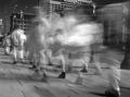
Walkby ralphComment by Ironworker: cool concept. Well executed, I think B & W adds to the overall effect. |
| 04/24/2005 06:41:00 PM |
Walkby ralphComment by kearock: The feet look cool, but the big white blur above them is distracting - a little too much motion blur I think. |
| 04/24/2005 12:54:10 PM |
|
| 04/24/2005 12:23:55 PM |
Walkby ralphComment by dwterry: I dunno... the long exposure is cool and all... it's just not captivating for some reason. |
Home -
Challenges -
Community -
League -
Photos -
Cameras -
Lenses -
Learn -
Help -
Terms of Use -
Privacy -
Top ^
DPChallenge, and website content and design, Copyright © 2001-2025 Challenging Technologies, LLC.
All digital photo copyrights belong to the photographers and may not be used without permission.
Current Server Time: 04/21/2025 06:24:20 AM EDT.