DPChallenge: A Digital Photography Contest You are not logged in. (log in or register
 
Browse Settings
Currently viewing:
Registered Userladyanni

Show comments:

Per page:

Order:

Comments:


Comments Received by ladyanni
Pages:  
Showing 21 - 30 of ~63
Image Comment
Sweet Lovin
02/01/2006 10:51:11 AM
Sweet Lovin
by ladyanni

Comment by Ennil:
Looks like a simple snapshot. The vignetting is very unecessary.

You got the couple, you got the subject, you got the potential. What you could have done is chosen a better setting, used a better light and not flash and closened up onto the kiss.
Sweet Lovin
02/01/2006 06:15:59 AM
Sweet Lovin
by ladyanni

Comment by RichSeal:
Cute couple but I don't think the border works very well. It crops out too much of the guys head.
An eewie oops!
01/08/2006 09:37:24 PM
An eewie oops!
by ladyanni

Comment by HBunch:
*Critique Club*

Looks like an error in submission got your the brown ribbon. By the title, looks like this was meant to be in the oops challenge, and obviously, people noticed.
You requested an in depth critique, however, have not been back since you submitted your photo to even look at the feedback you recieved, which leads me to believe that you don't really care, and this will be a complete waste of my time, however, here is the in depth critique you requested from the Critique Club...
Since you give me no photographers comments, my critique can only be based on personal opinion alone, since I have no clue what your intentions were with this photo. In the future, if you would like a more technical critique, please include some photographer's comments letting us know what you were trying to achieve.
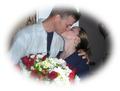
My first reaction to the photo is that it's not a very appealing image. Who wants to look at a photo of someone who's trying to keep snot from hanging out of their nose? Do I have a personal attachment to this photo? Certainly not.
The colors look like they are very nice, but the forground and subject are a bit dark, which mutes the colors a bit.
The thing hanging from the top right of the photo (roof or umbrella?) is distracting.
The focus is soft. A more crisp focus would help to bring out some detail and add something to look at.
The angle is also awkward. Looks like you were sitting in a chair or something when you took this pic. Either that or you are really short, in that case, my apologies. I would prefer to see this from a more eye level view.
Overall nice color, but just not appealing to me on a personal level. ~Heather~
An eewie oops!
01/03/2006 11:39:28 PM
An eewie oops!
by ladyanni

Comment by HVGB_photos:
By the title, I think this photo is in the wrong challenge...
An eewie oops!
01/02/2006 06:15:32 PM
An eewie oops!
by ladyanni

Comment by Pixlmaker:
Wrong competition.
An eewie oops!
01/02/2006 03:01:28 PM
An eewie oops!
by ladyanni

Comment by marcellieb:
What patern - think this one is in the wrong chalenge
An eewie oops!
01/02/2006 10:51:45 AM
An eewie oops!
by ladyanni

Comment by theSaj:
think this was in the wrong challenge... *lol*
An eewie oops!
12/31/2005 10:45:33 PM
An eewie oops!
by ladyanni

Comment by shanksware:
wrong challenge
that said, If this is for Oops, I don't get it. Where's the oops?
Focus seems soft. Good color though.
An eewie oops!
12/31/2005 06:34:04 PM
An eewie oops!
by ladyanni

Comment by Melethia:
I suspect you meant this for the other challenge.
An eewie oops!
12/31/2005 05:34:29 PM
An eewie oops!
by ladyanni

Comment by Robby:
wrong challenge I think?
Pages:  
Showing 21 - 30 of ~63


Home - Challenges - Community - League - Photos - Cameras - Lenses - Learn - Help - Terms of Use - Privacy - Top ^
DPChallenge, and website content and design, Copyright © 2001-2025 Challenging Technologies, LLC.
All digital photo copyrights belong to the photographers and may not be used without permission.
Current Server Time: 03/13/2025 01:45:38 AM EDT.