| Image |
Comment |
| 07/11/2005 12:09:44 AM |
|
 Photographer found comment helpful. Photographer found comment helpful. |
| 07/10/2005 09:28:13 PM |
Crystal Etchingby tsheetsComment by ShutterPug: something about the lighting seems wrong here. Not sure how you would have corrected it prior to the shot, but needs some work in editing to get rid of the glare. |
| Photographer found comment helpful. |
| 07/09/2005 01:01:51 PM |
|
| Photographer found comment helpful. |
| 07/08/2005 11:50:34 PM |
|
| Photographer found comment helpful. |
| 07/07/2005 04:42:18 AM |
|
| Photographer found comment helpful. |
| 07/06/2005 06:36:17 PM |
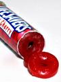
LifeSaversby tsheetsComment by BAMartin: The focus is just a little bit soft. Your colors are vibrant though. This is a shot you might want to try again but using a tripod. |
| Photographer found comment helpful. |
| 07/06/2005 01:42:06 PM |
Crystal Etchingby tsheetsComment by jemison: pretty image. I can't tell if it is soft on focus or if the etching just isn't sharp. Nice lighting. |
| Photographer found comment helpful. |
| 07/06/2005 02:24:54 AM |
LifeSaversby tsheetsComment by douzi0108: i like the sharpness.. makes the sweets look tasty.. wld be nicer if e sweets were laid out more naturally |
| Photographer found comment helpful. |
| 07/06/2005 02:14:27 AM |
LifeSaversby tsheetsComment by JeB: I know that it's hard to do on the shot - but I think the shot would work better if the entire package was in focus. The focal point (for me atleast) is the lifesavers lettering.. I think because it's the starkest contrast in the shot, but the focal point is slightly deeper than the focus. |
| Photographer found comment helpful. |
| 07/05/2005 05:02:01 PM |
|
| Photographer found comment helpful. |
Home -
Challenges -
Community -
League -
Photos -
Cameras -
Lenses -
Learn -
Help -
Terms of Use -
Privacy -
Top ^
DPChallenge, and website content and design, Copyright © 2001-2025 Challenging Technologies, LLC.
All digital photo copyrights belong to the photographers and may not be used without permission.
Current Server Time: 04/11/2025 11:48:15 AM EDT.