| Image |
Comment |
| 06/08/2006 08:29:18 AM |
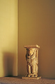
Persian Pedistal at Duskby chaliceComment by xianart: a well exposed image, but it just feels... empty. yeah, i know the challenge is empty room, but others feel filled with emptiness, while this one is just ...empty. i'm sorry, this makes no sense, does it?
i think this might have benefitted from a wider angel to have more room init, or a landscpe format, to emphasise the emptiness. i think that the expanse of wall is rather heavy on hte pedestal. |
 Photographer found comment helpful. Photographer found comment helpful. |
| 06/07/2006 11:01:40 PM |
A Glass of Wine with a Bottle to Goby chaliceComment by nards656: ==Trading Post==
I really like this compositions and the colors, even though the red is a little too "dense", whatever I mean by that! I like the sparkle on the glass.
The black is almost too black. I would like to see some shine and more of a reflection from the bottle. For some reason the black has a really "processed" appearance.
I really dig the texture in the wineglass. |
| Photographer found comment helpful. |
| 06/07/2006 09:22:01 PM |
A Glass of Wine with a Bottle to Goby chaliceComment by Kelli: Trading post...
This is an excellent shot. I can even see the condensation on the bottle. The little sparkle on the wine glass is excellent. I'm really surprised that this didn't score higher. Maybe the part of the wine glass that seems to be blown out hurt you, but I actually like it in the picture. Good job! |
| Photographer found comment helpful. |
| 06/07/2006 09:13:59 AM |
|
| 06/06/2006 09:25:17 PM |
|
| Photographer found comment helpful. |
| 06/06/2006 12:44:08 PM |
|
| 06/06/2006 09:54:21 AM |
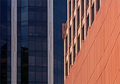
Architectural Colorsby chaliceComment by Kelli: Trading post...
Nice use of colors. The lines are very crisp and uncluttered. This photo would stand on it's own without the challenge which I think makes a photo great. You could see this on an office wall. Great job. |
| Photographer found comment helpful. |
| 06/05/2006 11:05:26 PM |
Architectural Colorsby chaliceComment by Melethia: Trading Post comment
Composition/subject I rather like this composition - I like the use of the two strong leading lines, and the pattern in light orange above the darker orange. The complementary colors play off each other nicely, too.
Technical The lighting works well for this image - no harsh shadows which gives more strength to the architecture itself. A possible suggestion would be to see if you can darken the blue building a bit to either get rid of or tone down the stuff you can see inside the windows.
Meets challenge Yep, meets challenge! Some may not have seen it as very exciting architecture, but as I said, I like the way the two buildings play off each other.
My opinion Might not have appealed to the masses, but I like it! |
| Photographer found comment helpful. |
| 06/05/2006 10:54:55 PM |
Failure: Another Loser DPC Score!by chaliceComment by timfythetoo: Trading Post -
I didnt vote in this challnege but I would have probably gone with a 5 on this. Its a funny idea but lacking any kind of pop. More of your eye would have been nice and maybe a different color shirt. The shot has a brown kind of feel to it and a little bit of color could have livened it up a bit. The background is a bit distracting, but the overall focus is good. If you could have included something to send home the idea that its DPC that youare looking at outside of the title (maybe clutching a brown ribbon in your hand) that would have added to the interest. Overall not a bad shot just not a great one. |
| Photographer found comment helpful. |
| 06/05/2006 07:29:04 PM |
|
| Photographer found comment helpful. |
Home -
Challenges -
Community -
League -
Photos -
Cameras -
Lenses -
Learn -
Help -
Terms of Use -
Privacy -
Top ^
DPChallenge, and website content and design, Copyright © 2001-2025 Challenging Technologies, LLC.
All digital photo copyrights belong to the photographers and may not be used without permission.
Current Server Time: 04/23/2025 02:35:26 AM EDT.