|
|
|
Showing 2241 - 2250 of ~2579 |
| Image |
Comment |
| 06/05/2006 06:44:18 PM | |  Photographer found comment helpful. Photographer found comment helpful. |
| 06/05/2006 05:07:21 PM | | | Photographer found comment helpful. |
| 06/05/2006 01:44:27 PM | | | Photographer found comment helpful. |
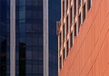
| 06/05/2006 05:24:33 AM | Architectural Colorsby chaliceComment by kirsty_mcn: Composition
Very nice shapes/angles, maybe would have suited a slightly tighter crop on the righthand side, so the transition wasnt right in the middle. Whilst I love all the lines and shapes and colours, the angle does make the righthand side a little busy (aat 640*480ish at least) just because there is so much detail.
Technical stuff (exposure, dof, lighting etc�)
Exposure and lighting seem good, I like the brightness of the reds against the duller blue glass.
Post-processing
n/a, all is fine and dandy imo
Message/atmosphere portrayed
very nice study of shapes and colours, with the juxtaposition of different styles of architecture
Meeting the challenge
Nice take on architecture - a real study of details rather than "a picture of an impressive building" (for example)
My personal opinion
This was underrated by far - I didn't vote on this challenge, but would probably have voted 7/8 | | Photographer found comment helpful. |
| 06/05/2006 04:56:07 AM | | | Photographer found comment helpful. |
| 06/05/2006 02:17:02 AM | | | Photographer found comment helpful. |
| 06/05/2006 12:43:12 AM | | | Photographer found comment helpful. |
| 06/04/2006 03:33:07 PM | Failure: Another Loser DPC Score!by chaliceComment by kirsty_mcn: Composition
composition is good, in terms of the "baghead" in the upper left third, and the laptop in the bottom right. The home/offic-ey environment makes it a more cluttered composition though, especially with the detail in the blinds.
Technical stuff (exposure, dof, lighting etc�)
wb seems a little off, but exposure and focus seem good. You may have been able to isolate the subject from the b/g more with a shallower dof though
Post-processing
I'd like to see a little more contrast in it, to make it pop more and be less snapshotty
Message/atmosphere portrayed
Well, you did kinda bring it upon yourself with that title! :P Although the paper bag fits, another way of "hiding" from your score may have been better, so as to make your expression visible and give more emotion.
Meeting the challenge
Yeah, sure
My personal opinion
I wouldn't have expected this to score very high, just because its quite a familiar idea - not necessarily exactly that idea, but in terms of comments on scores/people at laptops etc. Would have needed an extra creative something to bring it further Message edited by author 2006-06-05 05:16:46. | | Photographer found comment helpful. |
| 06/04/2006 02:55:01 PM | |
| 06/03/2006 08:07:54 PM | Failure: Another Loser DPC Score!by chaliceComment by DanSig: [[trading post]]
I didn't vote in Failure, but I think this image would only get a 5.
what I found wrong with it.. the Crop, it's in portrait mode, so you cut a part of the right hand, and a part of the computer, a full square crop could have included those.
the lighting is ok, but the whitebalance is wrong, the arms are really red, and the blinds seems a bit too tan.
you show a piece of one eye, to show the whole eye would have given the viewer a better connection with the subject.
and there is a small gap between blinds just above the computer screen. | | Photographer found comment helpful. |
|
Showing 2241 - 2250 of ~2579 |
Home -
Challenges -
Community -
League -
Photos -
Cameras -
Lenses -
Learn -
Help -
Terms of Use -
Privacy -
Top ^
DPChallenge, and website content and design, Copyright © 2001-2025 Challenging Technologies, LLC.
All digital photo copyrights belong to the photographers and may not be used without permission.
Current Server Time: 04/23/2025 02:24:14 AM EDT.
|