| Image |
Comment |
| 05/29/2006 12:36:01 PM |
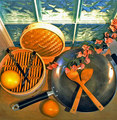
Asian Contemporary Still Lifeby chaliceComment by DanSig: [[trading post]]
this is a nice image, but I think it's too crowded, there is a lot of stuff to make food, but no food.
I think this would have worked better with some fresh veggies sliced in the Wok and some oil to make it shiny.
and those flowers just don't belong there.
it looks like you used a flash, and it burns out some areas in the picture, a soft light would heve been nice for this setup.
|
 Photographer found comment helpful. Photographer found comment helpful. |
| 05/29/2006 06:49:48 AM |
|
| Photographer found comment helpful. |
| 05/29/2006 12:40:09 AM |
|
| 05/28/2006 09:34:39 PM |
Man in a Panama Hatby chaliceComment by Kelli: Trading post...
Very nice shot. This has great lighting. The hat adds interest. I can't actually tell you any way to improve this unless you turned into Brad Pitt and shot yourself nude, LOL (just kidding ya know!). Maybe a little sharper around the eyes. |
| Photographer found comment helpful. |
| 05/28/2006 11:32:34 AM |
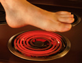
Hot Footin' Itby chaliceComment by Ecce_Signum: And here was me thinking I was stupid in my entry! Pity the foot isn't sharp and on my monitor there seems to be something funny going on with your toe nails? A definite feeling of heat here! |
| Photographer found comment helpful. |
| 05/28/2006 11:00:51 AM |
Man in a Panama Hatby chaliceComment by Melethia: Trading Post comment
I liked this when I came upon it in your portfolio, but I think that one was in B&W? I think I do prefer it in B&W. I like the us of the negative space - that plus the expression adds a touch of mystery. The softness in focus may have been what you were going for, but a bit more crispness on the face and especially the eyes would really add to this picture. |
| Photographer found comment helpful. |
| 05/28/2006 07:36:39 AM |
|
| Photographer found comment helpful. |
| 05/26/2006 11:31:28 PM |
Man in a Panama Hatby chaliceComment by Louis: A nice portrait, well framed. Perhaps a little tight. For example, more of your shoulders may have filled the frame out a bit, and keeping the hat entirely in the shot may have added to it. The catchlight in your eyes is excellent. I feel the image may have benefitted from more lighting, perhaps reflected onto the right side of the image (left side of your face). As well, the image is slightly soft - would have benefitted from some more aggressive USM. I think the choice of negative space as background is an excellent one. The expression on your face is unaffected, giving it an overall genuine, yet still somehow guarded (mysterious?) feeling. Well done. |
| Photographer found comment helpful. |
| 05/26/2006 05:12:39 PM |
|
| Photographer found comment helpful. |
| 05/25/2006 10:49:26 PM |
Night Light for the Wearyby chaliceComment by tngrndream: hello again,
sorry for the delay on this one.
to me it looks a bit ordinary and flat. i know the light is coming down harshly from the lamp above which is not ideal. it is a good shot considering what is available.
looks as though most people thought it was better than what i would have scored so i will go away. lol. |
| Photographer found comment helpful. |
Home -
Challenges -
Community -
League -
Photos -
Cameras -
Lenses -
Learn -
Help -
Terms of Use -
Privacy -
Top ^
DPChallenge, and website content and design, Copyright © 2001-2025 Challenging Technologies, LLC.
All digital photo copyrights belong to the photographers and may not be used without permission.
Current Server Time: 04/22/2025 07:19:49 PM EDT.