| Author | Thread |
|
|
05/25/2006 10:49:26 PM |
hello again,
sorry for the delay on this one.
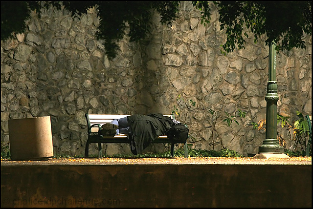
to me it looks a bit ordinary and flat. i know the light is coming down harshly from the lamp above which is not ideal. it is a good shot considering what is available.
looks as though most people thought it was better than what i would have scored so i will go away. lol. |
|
 Photographer found comment helpful. Photographer found comment helpful. |
|
|
05/21/2006 02:27:17 PM |
This is one of the nightshot's that stood out to me in the challenge - I like the subtle lighting and the composition. It doesnt give a big impression to me of nighttime, would be more suited to a candid challenge imho.
The lighting is perfect, keeping nice soft tones and detail. The framing of the trees and the horizontal wall (?) along the bottom works well to contain the subject, but I would crop of a little of the bottom - maintaining the stripe, but just not so much 'wasted' space.
I have to admit the shadow on the wall is rather distracting - makes it look to me as thought you have shot through railings or something. But its a great shot nonetheless, congrats on the personal best :) |
|
| Photographer found comment helpful. |
|
|
05/20/2006 06:57:12 PM |
Trading Post -
Congrats on you rnew high score - that always feels great. It looks like for some reason I did not vote on this. I think I would have given it a 6. I have no experience with long shutter speeds and would not have guessed this to be taken too late into the night. The lighting works very well and I like the variety of textures that you have within the frame. I am not so sure about the big bar down on the bottom. Otherwise a really good shot - well done. |
|
| Photographer found comment helpful. |
|
|
05/18/2006 07:23:59 AM |
[[trading post]]
I like the lighing, and the subject is good, but that concrete bin is not helping the image, if you'd crop that away then the bench would be close to the frame and coposition would be much better. |
|
| Photographer found comment helpful. |
|
|
05/17/2006 08:24:07 PM |
| Thanks for the kind comments. The dark line on the stone wall is the shadow of the lamp post (note that the post is lit on the front side and casts its own shadow to the background). As I understand the rules for this shot, dodge and burn is not allowed, so I couldn't figure out a way to get rid of the shadow without lightening the whole photo too much. |
|
|
|
05/17/2006 07:45:18 PM |
Trading Post comment
First - congrats on a new personal best score!! This is a good night shot that tells a story. I like the inclusion of the dark space in front balanced by the tree leaves along the top. The only distraction is the shadow or dark section running up the wall from the bench - not sure if it IS a shadow or where the wall has been stained. Still, the overall impact of this shot is very good. Well seen, well executed. |
|
| Photographer found comment helpful. |
|
|
05/17/2006 05:10:22 PM |
Trading post...
Congrats on your highest score! This is a great image. I didn't look at the entries on this challenge, so I can't gage in relation to others but to me it conveys a story, is shot at night and is different than the norm. So, it probably should have scored higher. That said... it's not a happy, feel good picture either. And it's a subject most would prefer to ignore. So to get that high with this type of image says it's very well done. If you were to edit this for a print, my only suggestion would be to lighten up that shadow that seems to be hitting him down the middle. |
|
| Photographer found comment helpful. |
|
|
05/17/2006 05:09:40 AM |
--Trading Post--
First of all, congrats on your highest scoring photograph to date!! I like your choice of subjects here. Many of us shot the city skyline, which I have personally gotten too comfortable with. You didn't. You chose a subject that was a bit out of the box, and it works well. My only critique is that the shadow running down the middle of the frame is very distracting. Perhaps a better position for the shot would have gotten this one into the top 30 or so. |
|
| Photographer found comment helpful. |
Comments Made During the Challenge  |
|
|
05/14/2006 11:29:00 PM |
| I feel that the bottom could have been cropped somewhat, but rather like the shot, nonetheless. Good work. |
|
| Photographer found comment helpful. |
|
|
05/14/2006 07:34:01 AM |
|
| Photographer found comment helpful. |
|
|
05/12/2006 01:19:16 PM |
| Great framing at the top with trees, the bottom looks a little strange though. It looks like the ground just falls away. I like the light cast by the streetlamp. Good photo-6, probably go 7 or 8 if the bottom didn't bother me so much. |
|
| Photographer found comment helpful. |
|
|
05/11/2006 09:14:52 PM |
| A strong message here..... |
|
| Photographer found comment helpful. |
|
|
05/11/2006 10:15:02 AM |
| Nice panoramic effect. I like the fact that you didn't cropped the lower part. It adds depth to the picture. Great framing from up with the branches. Very interesting feeling. |
|
| Photographer found comment helpful. |
|
|
05/10/2006 05:57:57 AM |
| This is a great photo. Nice colours |
|
| Photographer found comment helpful. |
Home -
Challenges -
Community -
League -
Photos -
Cameras -
Lenses -
Learn -
Help -
Terms of Use -
Privacy -
Top ^
DPChallenge, and website content and design, Copyright © 2001-2025 Challenging Technologies, LLC.
All digital photo copyrights belong to the photographers and may not be used without permission.
Current Server Time: 04/26/2025 03:02:26 PM EDT.