| Image |
Comment |
| 06/06/2002 12:40:00 AM |
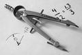
Mr. Langridge's Compassby tlalondeComment by irae: Very nice detail and contrast. The paper could be a little whiter, but I like the texture you can see in it. The writing / drawing could possibly be more consistent looking. The thin and thick lines don't work as well as they could, IMO. Also not sure I like the compass obscuring some of the printing. Small nits. Well done! |
| 06/05/2002 08:31:00 PM |
|
| 06/05/2002 07:17:00 PM |
|
| 06/05/2002 12:27:00 PM |
|
| 06/04/2002 11:03:00 PM |
Mr. Langridge's Compassby tlalondeComment by jmsetzler: Wonderful compositoin and clarity on this photo... the soft shadows work very nicely here! This is one of the best photos out here this week... great job! |
| 06/04/2002 10:57:00 PM |
|
| 06/04/2002 04:33:00 PM |
|
| 06/04/2002 03:09:00 PM |
Mr. Langridge's Compassby tlalondeComment by GeneralE: I like the subject -- a litle over-sharpened for my taste, though. Also, I have one of these -- I think this version is technically known as a "bow-pencil" -- mine has a cool double-nibbed india ink tip which attaches where the lead is... |
| 06/04/2002 10:19:00 AM |
|
| 06/04/2002 02:55:00 AM |
|
Home -
Challenges -
Community -
League -
Photos -
Cameras -
Lenses -
Learn -
Help -
Terms of Use -
Privacy -
Top ^
DPChallenge, and website content and design, Copyright © 2001-2025 Challenging Technologies, LLC.
All digital photo copyrights belong to the photographers and may not be used without permission.
Current Server Time: 04/21/2025 06:36:53 AM EDT.