| Image |
Comment |
| 07/06/2005 12:29:01 PM |
|
| 07/06/2005 12:19:39 PM |
|
| 07/06/2005 12:04:08 PM |
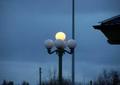
Lightsby ofurpesiComment by JayWalk: Slighly more cropping and making it a little larger would have helped. Also the pole on the right is distracting. |
| 07/06/2005 09:43:12 AM |
Lightsby ofurpesiComment by saracat: When you submit a photo this small, you don't allow voters to see what you've really photographed. I like the colors in the pic, and I like how the one lamp is lit up. The only other thing I can see with enough detail to comment on is the fact that one of the lights has a pole growing through it, which is something that could be corrected by moving to one side or the other while shooting. |
| 07/06/2005 09:03:50 AM |
|
| 07/06/2005 03:51:07 AM |
|
| 07/06/2005 03:49:25 AM |
Lightsby ofurpesiComment by Talarria: As this is a stationary object, I would suggest a different point of view so you dont end up with a pole running through your main focal point. I would also suggest some cropping so the distracting element (roof?) on the right is removed. Also, try to avoid centering your main subject in the center of your image - offset subjects can help create more visually appealing images. |
| 07/06/2005 01:12:48 AM |
Lightsby ofurpesiComment by HBunch: Wow...this is really tiny. You'll probably hear this a zillion times, but the best advice you'll get here is to submit a larger pic. If you got a 'file too large' message, then the ideal solution would be to compress a little smaller, rather than make the pic itself smaller. It's really hard to tell details from this small of a pic, but I will say that the strong vertical line through the image (a post?) is distracting as is the corner of the roof. The lights are interesting, but again, hard to see. It looks like if you had moved yourself to the right and closer to the groud and gotten up a bit closer on the lights, it might have been a better composition. Can't tell how focus is. Color is ok. ~Heather~ |
| 07/06/2005 12:59:16 AM |
Lightsby ofurpesiComment by art-inept: wow we have that exact same lamp on our porch! maybe position the camera in such a way that the pole in the background doesn't cut through your picture? :) |
Home -
Challenges -
Community -
League -
Photos -
Cameras -
Lenses -
Learn -
Help -
Terms of Use -
Privacy -
Top ^
DPChallenge, and website content and design, Copyright © 2001-2025 Challenging Technologies, LLC.
All digital photo copyrights belong to the photographers and may not be used without permission.
Current Server Time: 03/13/2025 04:58:25 AM EDT.