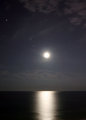
DPChallenge: A Digital Photography Contest You are not logged in. (log in or register
 
Browse Settings
Currently viewing:
Registered Userrenegade1966

Show comments:

Per page:

Order:

Comments:


Comments Received by renegade1966
Pages:   ... ...
Showing 351 - 360 of ~403
Image Comment
Moon Reflection (cropped)
10/01/2006 02:02:01 AM
Moon Reflection (cropped)
by renegade1966

Comment by LucidLotus:
I absolutely agree, I think this looks much better, it has such a soft, ethereal look to it. I love that the stars are still there and they seem even more integral to the shot now. Excellent capture and much improved with the additional processing.
Photographer found comment helpful.
Wasting Away
09/24/2006 09:22:31 PM
Wasting Away
by renegade1966

Comment by ambaker:
Critique Club Review:

I like the way the lighting separates the tree from the rest of the picture, it meets the challege very well.

The detail and texture are excellent.

However, I might have liked it a bit more, had you used a shallower depth of field to isolate the tree from the background as well.

In the upper areas, especially on the right side, the background is almost seeming to engulf the tree and competes for attention.

Color, saturation, hue, contrast, and brightness are all done very well.

Nice photo.
Photographer found comment helpful.
Moon Reflection (cropped)
09/18/2006 08:20:09 PM
Moon Reflection (cropped)
by renegade1966

Comment by klstover:
I definitely think this is an improvement on the original composition! Much more mystical and beautiful, I think.
Photographer found comment helpful.
Moon Reflection.jpg
09/18/2006 06:44:25 AM
Moon Reflection.jpg
by renegade1966

Comment by LucidLotus:
This is a magical image. I absolutely love the smooth metallic feel to the water and then to have the moonrise and some stars visible in the sky? Excellent.

I'll echo a few thoughts already mentioned by other commenters. First and foremost level out that horizon. It'll make a huge difference in the balance of the image. Hopefully it won't cause you to crop out that bright star on the left but between a level horizon and the star, the horizon wins.

Also the balcony ledge is adding a yucky grey tone to this image so that should be cropped out, and really the beach's brown tone though nice doesn't seem to fit the cooler hued, more darkness intense duality the sky and ocean have. I'd crop that out completely as well.

What that will leave is a fantastic play of two elements, the ocean and the sky, both have some nice dark qualities, the ocean offers a strong base, some fabulous smoothness, a metallic sheen and that wonderful moon reflection line. The sky then let's this image breathe, lightens things up just a bit and helps enhance the expansive feel of the ocean. Not to mention the hint of clouds in the horizon and upper corner and also those wonderful accents - the stars.

Typically I think it would be nice for the moon to be more detailed and less a ball of white, but here I think with how well the dynamic between the water and sky work, the moon is much more of a secondary player, there to help enhance the mood of the two elements rather than play first fiddle. Of course, were the moon to have some of the clarity and focus that are evident in the other moon photos I saw in your portfolio that would proabably elevate this image even more.

I keep scrolling the image to ensure I examine everything but I have to say I love how it looks when I crop out the bottom portion. I think you could also safely crop out a bit of the sky and still keep the same dynamic - since the sky is much more prevalent than the ocean you have some room to crop. But I would caution not to crop too much because the ratio of sky to water is one of the backbones that gives the shot strength. I'd say no more than 3/4 of an inch of the top.

I think this is a great capture and with just a bit more fussing it can shine even more, but you've done an excellent job getting a great starting point.
Photographer found comment helpful.
Wasting Away
09/16/2006 07:43:52 PM
Wasting Away
by renegade1966

Comment by szalona:
this is pleasantly peculiar
You Lookin'  At Me.jpg
09/15/2006 11:50:15 PM
You Lookin' At Me.jpg
by renegade1966

Comment by jmlelii:
The composition feels too "centered" for me. The image contains a lot of noise, and the focus seems to be in the wrong spot... it should be sharp in his eyes. A great effort none the less.
Photographer found comment helpful.
Wasting Away
09/15/2006 07:41:31 PM
Wasting Away
by renegade1966

Comment by scaramanga:
Great find. I would prefer a bit more space for the object (tree) to breathe.
Photographer found comment helpful.
Wasting Away
09/13/2006 12:27:02 PM
Wasting Away
by renegade1966

Comment by naplesmusc:
the foreground tree is well highlighted. Nice detail.
Photographer found comment helpful.
Wasting Away
09/13/2006 12:51:51 AM
Wasting Away
by renegade1966

Comment by neophyte:
Needs contrast or a levels adjustment. Nice comp and different idea.
Photographer found comment helpful.
Wasting Away
09/12/2006 11:03:24 PM
Wasting Away
by renegade1966

Comment by xXxscarletxXx:
For some reason.. I absolutely love this 9
Photographer found comment helpful.
Pages:   ... ...
Showing 351 - 360 of ~403


Home - Challenges - Community - League - Photos - Cameras - Lenses - Learn - Help - Terms of Use - Privacy - Top ^
DPChallenge, and website content and design, Copyright © 2001-2025 Challenging Technologies, LLC.
All digital photo copyrights belong to the photographers and may not be used without permission.
Current Server Time: 03/12/2025 08:54:52 AM EDT.