DPChallenge: A Digital Photography Contest You are not logged in. (log in or register
 
Browse Settings
Currently viewing:
Registered Userjansku

Show comments:

Per page:

Order:

Comments:


Comments Received by jansku
Pages:   ... ...
Showing 121 - 130 of ~217
Image Comment
Disposal
11/11/2005 12:05:47 PM
Disposal
by jansku

Comment by neophyte:
I like the tones here.
Photographer found comment helpful.
Disposal
11/10/2005 06:54:38 PM
Disposal
by jansku

Comment by tpoc:
i like this image. you can see how full the disposals are, and yet the trash keeps on coming.
Photographer found comment helpful.
Disposal
11/09/2005 12:33:34 PM
Disposal
by jansku

Comment by Mr_Pants:
Great clarity and sharpness. A pity about the pole behind the man.
Photographer found comment helpful.
In a friendly way
11/06/2005 05:17:37 PM
In a friendly way
by jansku

Comment by CEJ:
Hello from the Critique Club!

I have studied your image and offer the following:

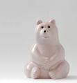
Composition/perspective - very nice application of rule of thirds. Your subject is the right size for the shot as well (subject to negative space ratio). Getting to 'eye' level with your subject was exactly the right perspective for this shot as well. At first I thought this looked sort of statice and flat, but when you really look at it you can see a lot more definition of shape in the bear than first appears. Just a suggestion, try turning the bear slightly to the left (since it is on the right) to add more shape and depth to the bear. This would allow more of the curve around to the back to show.

Color - the subtle color of the bear is well captured while your white background is still white. Post processing was not too harsh so as to remove the speckles in the coloring. With a light on white I would not expect to see a lot of color anyway.

Lighting - overall your lighting is done well. It appears as though one light source was used - to the left. My only dislike is the glares (as you pointed out). However, the only one that is any kind of a distraction is the one on the arm. Perhaps if you had used a faster shutter speed it would not have gotten so bright and any loss in intensisty of the rest of the image could have been brought back with a levels adjustment. I just don't think you gaind much by a 3 second shutter speed and infact it may have been the culprit to the glares being so bright.

Challenge requirements - this has certainly met the requirements of the challenge. Your subject is definitely light and your lighting is good that it has not caused any dark shadows. A small bounce to the background may have brightened that up a bit while not sacrificing anything in the foreground.

Overall/my opinion - I think this got lost on the viewers. As stated above, maybe a slightly different angle to the subject may have made it pop out of the background more and not appear flat. Again, a faster shutter speed may also yhave helped with the glares on the arm.
Photographer found comment helpful.
60° 29" N 26° 50" E
11/04/2005 10:51:14 AM
60° 29" N 26° 50" E
by jansku

Comment by olddj:
very nice effect
60° 29" N 26° 50" E
11/02/2005 06:38:21 PM
60° 29" N 26° 50" E
by jansku

Comment by KarenNfld:
Very nice.
In a friendly way
10/28/2005 10:44:36 PM
In a friendly way
by jansku

Comment by olddj:
background SLIGHTLY off white, but nicely done
Photographer found comment helpful.
Whatshouldisubmit?!
10/24/2005 03:21:47 AM
Whatshouldisubmit?!
by jansku

Comment by 3DsArcher:
The eternal question
Glitter
10/23/2005 10:29:48 AM
Glitter
by jansku

Comment by PollyBean:
... Saw this linked from the "What was I thinking thread"...

I like the hexagonal bokehs! I really don't think this is deserving of a 4.1. Your idea was sound, just a little bump in arrangement and lighting, would have made this more popular. Maybe if the challenge title was glittery things would be differnet! (IMHO hehe :) )

Message edited by author 2005-10-23 10:32:02.
Whatshouldisubmit?!
10/22/2005 04:42:42 PM
Whatshouldisubmit?!
by jansku

Comment by RonBeam:
I like the literal-thought-turned-into-a-photograph style of theme interpretation that you utilized. That is an excellent training tool for representative photography. You need to follow that up, however, with compositional considerations of equal importance to the process in order to claim success. Bricks (because of their chaotic linear nature) rarely make a good background, unless very, very out of focus. The strong lighting and harsh shadow introduced by a single flash can almost never compliment skintones. For people portraits, consider shaded outdoor lighting or using a white bounce card on the opposite side of the model from a window through which pours diffused sunlight. If skintones still are a problem, convert to B&W which is nearly always more kind to skin. Put your creativity for theme ideas into the art of photography and we will witness another bright light at this website. 6
Photographer found comment helpful.
Pages:   ... ...
Showing 121 - 130 of ~217


Home - Challenges - Community - League - Photos - Cameras - Lenses - Learn - Help - Terms of Use - Privacy - Top ^
DPChallenge, and website content and design, Copyright © 2001-2025 Challenging Technologies, LLC.
All digital photo copyrights belong to the photographers and may not be used without permission.
Current Server Time: 04/10/2025 08:05:19 AM EDT.