| Image |
Comment |
| 04/29/2007 09:45:08 PM |
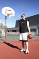
Basketballby saevarjoComment by LalliSig: This is certainly Icelandic :) A bit too bright for my taste, had you exposed this half or a third of a stop less, you would have gotten stronger colors and some more detail in the white areas of this shot, try it next time, I´ll bet you´ll agree. |
 Photographer found comment helpful. Photographer found comment helpful. |
| 04/25/2007 08:43:39 AM |
|
| Photographer found comment helpful. |
| 11/07/2006 05:42:14 PM |
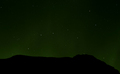
electrifiedby saevarjoComment by ladyhawk22: I think perhaps a horizon with a little more variance might offer a bit more interest for this shot, but the stars came out really well. |
| Photographer found comment helpful. |
| 11/07/2006 01:05:04 PM |
|
| Photographer found comment helpful. |
| 11/04/2006 05:14:22 PM |
|
| Photographer found comment helpful. |
| 11/03/2006 07:30:00 AM |
|
| Photographer found comment helpful. |
| 11/03/2006 04:52:00 AM |
|
| Photographer found comment helpful. |
| 11/02/2006 08:24:44 PM |
electrifiedby saevarjoComment by L1: Great long exposure. Love the hint of green the northern lights give off! :) |
| Photographer found comment helpful. |
| 10/17/2006 07:51:01 AM |
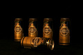
Tuborg Goldby saevarjoComment by atupdate: Hello from the Critique Club,
Let me start off by saying I like the composition of your entry. The can laying on its side give the image a strong focus point and sets it apart from many of the images in this challenge that showed a long line of beverage containers. I also like the gold coloration of the lighting, as it works well with the gold color of the cans. So why didn't this image score better? There are a few technical issues with this image that are easy to fix. First, the image looks a little flat. If you bump up the gamma in levels and bump up the contrast, the cans end up looking a lot more three-dimensional. Second, the focus appears to be a little soft. There are several possible reasons for this but the most likely is that the image needs to be sharpened more after reducing the size to 640 pixels. Most people us Unsharp Mask to accomplish this. If you did use USM after reducing the size, you may want to run it a second time. The third issue is the reflection on the can that is lying on its side. On the upright cans, the catch light is much smaller is size and is pleasing to look at. On the tipped can, the catch light effect is very large and distracting. The size could have been reduced or eliminated by rotating the can to change the angle that the light bounced off it. And finally, the dark space above the cans is a little large. Although this may be helpful for adding words to an advertisement, the image was being judge by photographers as a photograph.
Feel free to PM me if you have any questions regarding this critique or if you have problems understanding any of my comments.
Tim
|
| 10/10/2006 05:40:08 PM |
Tuborg Goldby saevarjoComment by Blink_Too_Fast: Nice lighting & colours & black background, but WAY too much "sky". Try cutting most of the top off the picture for a wide aspect ratio |
Home -
Challenges -
Community -
League -
Photos -
Cameras -
Lenses -
Learn -
Help -
Terms of Use -
Privacy -
Top ^
DPChallenge, and website content and design, Copyright © 2001-2025 Challenging Technologies, LLC.
All digital photo copyrights belong to the photographers and may not be used without permission.
Current Server Time: 03/12/2025 10:35:46 AM EDT.