Demon Possessed Childby
Penny LaneComment by lucienaw: (¯`·._.·[Critique Club]·._.·´¯)
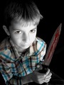
I was surprised that this photograph didn't actually get further in the competition. It has the meaning, composition, and settings to be a winning image. I especially like your use of selective desaturation not just to bring alive certain parts of the photograph, but also to 'deaden' a few of the more sinister aspects.
So, I'll work from the top down. The hair on your son's head has been lit and photographed well and is perfect for your use here. It's common to find annoying reflections and shadows on and in the hair in photographs these days and you seem to have captured it without any problems. The slight upward lift of a few stray hairs on the right work both for and against this photo. They can be slightly distracting from the image itself, but once thought about a bit more, depict what the boy may have been through after 'blood-staining' his knife. I think you may have gone too close to the middle though. It may have been better to either have simple and background hair, or to have it really messed up; but none of this is really crucial to your photograph.
As we follow the photo down, we reach those brown eyes that portray most of the meaning in this photo. The selective desat. here proved very effective to bring out the 'possessed' part of the boy by showing how there seems to be a different, colourful person inside the greyer boy. The expression on his face seems fitting for the picture although, again I think it is a case of going in the middle. Perhaps a blanker expression or slightly over the top more manic grin may have proved more effective in lying with the 'demented' portion of your photo. I'd say the same about the blood. I think that the blood being just on the knife and the boy remaining so clean slightly ruins the effect here. A cleaner knife could have created a form of suspense, whereas more of the red food colouring may have created a more credible 'post-killing'.
The position from where you took this photo has worked very well and is certainly one of the winning aspects in this image. There are many different feelings one can create when photographing from different angles, e.g. powerful from below, weak from above. The angle of the camera in this photograph has really brought out the knife as being almost bigger than the boy and so we have to think twice about the subject of this image. The eyes line up well and convey how the boy could be thinking more about the knife that he's holding and what he's just done, instead of just posing for a picture. Interestingly, he is still smiling if he were thinking just thoughts which brings a rather unsettling image to us.
I agree with a few of the comments that were left by other people about how the boy doesn't quite seem capable of killing (although I think posthumous's comment may have been a little over the top). The way he holds the knife seems a little to kind and careful as opposed to demented, and the timidness in the eyes don't make me feel threatened at all. In fact, if one covers up the knife, the title is lost. So I think that perhaps a better use of helping the different elements agree may have improved this photo's rating.
With all that said, however, I think that the photo is effective and well taken. You clearly made a few decisions when taking and editing the image and I think that they all paid off to work together to bring this alive. Photographers all have different strengths when it comes to their particular styles of taking photos. Judging from your past competition entries, I'd say that your strengths would be more of action and motion photographs rather than portraits, but keep taking them and improving them and soon you'll be producing photos easily capable of higher ratings. Well done on a good photo, and good luck with further competitions!
.·´¯`·->Lucien<-·´¯`·.