| Image |
Comment |
| 03/15/2010 07:00:59 PM |
|
 Photographer found comment helpful. Photographer found comment helpful. |
| 04/30/2009 11:56:38 PM |
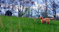
Where No Puppy's Gone Beforeby JammurComment by dafletchr: I think you have alittle camera shake going on, but there is some nice focus on the dog. Wonder what it would look like cropped in to him some more. Just a thought. |
| Photographer found comment helpful. |
| 04/29/2009 10:48:12 PM |
Where No Puppy's Gone Beforeby JammurComment by kaiser_chief: There is something about this photo that haes just made my eyes go weird. I think it is the out of focus trees that is just at the range that my eyes are trying to focus it. Very disturbing. Hard to comment the photo when I have to do it in 2 sec looks.
Nice idea and composition. But the focus makes it hard for me to look at it.........Just commenting, not voting anyway |
| Photographer found comment helpful. |
| 04/28/2009 10:19:50 PM |
Where No Puppy's Gone Beforeby JammurComment by Teafran: A good image of a curious pup. From a technical standpoint, it's not a great image because of the lens/motion blur and the very slight oversharpening of the dog. A little more camera control along with some motion control would have brought out more detail and given the image a little more impact from an artistic standpoint. A good solid entry into the challenge. |
| Photographer found comment helpful. |
| 04/27/2009 08:30:42 PM |
Where No Puppy's Gone Beforeby JammurComment by HeiSch: Very hard to comment on, I have to admit. But I'll try. THe overall impression is ... too busy and to much blur. You probably tried to capture the motion, but then atleast one part should still be sharp and in focus. And with pets, it should be the head with the eyes. THe horizon is cutting right through the puppy's head, creating an unbalancing impression. And because the head is pointing away from the viewer the lines of the horizon and the shoulder of the dog focus the viewer on the tail of the dog. I'm pretty sure this was not your intention, right? |
| Photographer found comment helpful. |
| 04/27/2009 01:46:15 PM |
|
| Photographer found comment helpful. |
| 04/20/2009 01:23:45 PM |
|
| Photographer found comment helpful. |
| 04/18/2009 05:32:14 PM |
|
| Photographer found comment helpful. |
| 04/17/2009 10:11:50 PM |
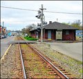
NEWPORTby JammurComment by Teafran: A little better lighting control reducing the highlights would have been a plus. Not an overly interesting image from an artistic sense, it does provide a lot of detail and color differences. A little more thought into the composition would have made for a better image. A good entry into the challenge, it falls just short of being truly effective. Perhaps a little change in viewing angle would have helped. |
| Photographer found comment helpful. |
| 04/17/2009 01:14:23 PM |
NEWPORTby JammurComment by Panks: I like this photo.. somehow it looks a bit over saturated. |
| Photographer found comment helpful. |
Home -
Challenges -
Community -
League -
Photos -
Cameras -
Lenses -
Learn -
Help -
Terms of Use -
Privacy -
Top ^
DPChallenge, and website content and design, Copyright © 2001-2025 Challenging Technologies, LLC.
All digital photo copyrights belong to the photographers and may not be used without permission.
Current Server Time: 04/02/2025 12:13:48 PM EDT.