| Image |
Comment |
| 09/08/2007 10:56:32 AM |
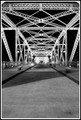
Crosswalkby ryandComment by bassbone: I think you have a good eye for symmetry here - but I must agree with an earlier poster that there seems to be a bit much foreground. You have a lot of great shapes above but it only really takes about half the image. In addition, the choice with very high contrast seems to take away from the details in the iron work above. I gave it a 6. Clearly it is a good image but not one that jumped off the screen |
 Photographer found comment helpful. Photographer found comment helpful. |
| 09/08/2007 10:56:16 AM |
Crosswalkby ryandComment by awpollard: Didn't vote this one... Sorry but I couldn't have given it much more that a 5. IMO, the interest level is just not happening. It seems to turn to mush dead (bright and not so clear) center in the shot. I personally am not a fan of leading lines that lead to the center of the frame...too calculated for me. As presented, I would have have liked to see the ground level that is leading me in be the sharp point.
Just my 2 cents... |
| Photographer found comment helpful. |
| 09/08/2007 10:51:36 AM |
Crosswalkby ryandComment by trevytrev: Saw your post about your score and thought I would leave a comment. First it's a good shot, don't get to down on the score. I do belive that the main problem is that the horizon line is dead center in the photo. Most photos look more dynamic following the rule of thirds, so the photo might have had more appeal if the horizon line were placed 1/3 from the top or bottom. I also feel that this could be a bit sharper, another run through USM or smart sharpen to reeally crisp up the wonderful lines. Hope these help a bit and these are just my opinions!
edit for typo Message edited by author 2007-09-08 10:58:27. |
| Photographer found comment helpful. |
| 09/08/2007 10:47:57 AM |
Crosswalkby ryandComment by zxaar: If you ask my honest opinion, I feel the crop makes it little bit boring. I think the crop could be little but better than this. Specially at the bottom there is lot of empty space.
But I think 5.3 does not mean that it is bad photo. |
| Photographer found comment helpful. |
| 09/05/2007 07:34:25 PM |
|
| Photographer found comment helpful. |
| 09/04/2007 08:23:46 PM |
|
| Photographer found comment helpful. |
| 09/02/2007 08:34:04 AM |
Crosswalkby ryandComment by SaraR: Superb composition. The way the white of the structure stands out against the black of night is impressive. |
| Photographer found comment helpful. |
| 09/02/2007 12:40:05 AM |
|
| Photographer found comment helpful. |
| 08/31/2007 10:27:55 PM |
DSC_6493by ryandComment by Kronus: I find having the DOf in the centre distracting ,I would crop out a bit on the right |
| Photographer found comment helpful. |
| 08/30/2007 08:10:10 PM |
|
| Photographer found comment helpful. |
Home -
Challenges -
Community -
League -
Photos -
Cameras -
Lenses -
Learn -
Help -
Terms of Use -
Privacy -
Top ^
DPChallenge, and website content and design, Copyright © 2001-2025 Challenging Technologies, LLC.
All digital photo copyrights belong to the photographers and may not be used without permission.
Current Server Time: 04/18/2025 02:02:29 AM EDT.