| Image |
Comment |
| 09/27/2006 01:14:40 AM |
|
 Photographer found comment helpful. Photographer found comment helpful. |
| 09/25/2006 03:10:24 PM |
|
| Photographer found comment helpful. |
| 09/23/2006 09:08:42 AM |
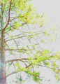
Regal Pineby 777STANComment by 777STAN: Originally posted by ambaker:
Critique Club:
Hard to say what happened here. But it is much too bright. The lower left third of the frame, the glare makes it look as if it were shot through a window into the sun.
The unusual colors, and the way some of the limbs run parallel, it almost appears to be a double exposure. But under close inspection it appears not to be the problem either.
Color, saturation, and hue appear to be way off; if a realistic rendition were intended. But there isn't enough there to tell the viewer an abstract interpretation is required. Brightness is too bright, contrast is a bit low.
The sky has become washed out and a blank canvas, just begging for detail such as clouds or a brilliant blue color.
I'm thinking this picture might work better in black and white, with a bit more contrast it would wind up looking like a Japanese ink drawing. |
Thanks! I tend to agree! Here it is!  Message edited by author 2006-09-23 09:10:18. Message edited by author 2006-09-23 09:10:18. |
| 09/23/2006 08:48:13 AM |
Regal Pineby 777STANComment by 777STAN: This photo is washed out for too reasons, one foolish...one logical. I was "testing the waters" of everyone's opinions & monitors as to the far edge of saturation. (Thanks loads! I found out because this is my only last place finish!)
Secondly, I wanted the details you see in the trunk which made the needles look "unnatural." SOL :( |
| 09/23/2006 03:13:26 AM |
Regal Pineby 777STANComment by ambaker: Critique Club:
Hard to say what happened here. But it is much too bright. The lower left third of the frame, the glare makes it look as if it were shot through a window into the sun.
The unusual colors, and the way some of the limbs run parallel, it almost appears to be a double exposure. But under close inspection it appears not to be the problem either.
Color, saturation, and hue appear to be way off; if a realistic rendition were intended. But there isn't enough there to tell the viewer an abstract interpretation is required. Brightness is too bright, contrast is a bit low.
The sky has become washed out and a blank canvas, just begging for detail such as clouds or a brilliant blue color.
I'm thinking this picture might work better in black and white, with a bit more contrast it would wind up looking like a Japanese ink drawing. |
| Photographer found comment helpful. |
| 09/21/2006 10:18:52 PM |
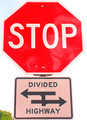
Oxymoron: Leading One-Linersby 777STANComment by alanfreed: This doesn't really work well for me in terms of fitting the challenge, and even if it did, it seems a bit wishy-washy in quality. The colors seem to have a pinkish glow to them, particularly on the bottom sign. |
| Photographer found comment helpful. |
| 09/20/2006 01:21:26 PM |
|
| Photographer found comment helpful. |
| 09/20/2006 12:57:00 AM |
|
| Photographer found comment helpful. |
| 09/17/2006 08:27:55 PM |
|
| Photographer found comment helpful. |
| 09/16/2006 08:27:32 AM |
Regal Pineby 777STANComment by SDW: Nice idea on the composition but the photo is blown out to the point it is very hard to judge. You must have been shooting into the sun. Next time you may want to try shooting with the sun to your left to get more detail and it will help loose the sun glare. |
| Photographer found comment helpful. |
Home -
Challenges -
Community -
League -
Photos -
Cameras -
Lenses -
Learn -
Help -
Terms of Use -
Privacy -
Top ^
DPChallenge, and website content and design, Copyright © 2001-2025 Challenging Technologies, LLC.
All digital photo copyrights belong to the photographers and may not be used without permission.
Current Server Time: 04/22/2025 10:08:51 PM EDT.