The World's BEST Best Seller!by
777STANComment by karmat: CRITIQUE CLUB CRITIQUE
by karmat
Intial response -- I agree totally. Very interesting take on the challenge, and a great example.
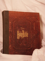
Compositionally, while this arrangement works for a lot of "product" type shots, here it kinda feels static. The Bible is obviously the focal point, yet it is centered and the eyes go to the Bible and really have no where else to look. Also, by shooting it straight on, it gives it a really flat appearance. To make it more interesting, perhaps a different angle (the book OR the camera, either one) for shooting, or even have it open to a passage. It looks like there is some nice textures in the cover, so emphasizing them would work well, too.
Technically, the focus seems a touch soft, but not terribly so. I think what probably hurt the most is the muted color tones. I don't know what software you were using, but look to see if it can adjust for white balance. The cloth looks like it is supposed to be white, but looks kinda like a muted pink to me. I also think it needs a bit more contrast as it is all rather flat looking. I do like how the cloth drapes over the corner, but because it is out of focus, it is more distracting than helpful, I think.
Into the minds of the dpc voters -- Books are often considered "static" subjects. As a result, something dramatic has to be occurring to push it over the top. This can be done with composition, technique, lighting, or all three. Because the picture is a bit "flat," there isn't really anythign to reach out and "grab" the viewer and compel him/her to stay with your picture long enough to give it a higher vote.
Overall, I think you have a good idea here. If you ever decided to reshoot this particular shot, I would be interested to see what it would look like if you tried some of the following ideas. (Mind you, they may not help, I'm just trying to give you some ideas for "next time.")
*Use a white silky type of background cloth. This would contrast with the Bibles old cover and add some interest. It would also be easier (I think) to make a pure white out of it.
*Set the book on the angle, so that at least some of the pages are showing. This would help to give the book a better feeling of "dimension," and perhaps the overall shot would not feel so flat.
*Use dramatic lighting. Light from above to be like a spot light. Or from one side or the other to cast some interesting shadows.
*Put the Bible in a contextual setting. Someone reading it, on an alter, a table, etc. This would also help with the storytelling aspect and would make it more interesting so the viewers would look at it longer.
Hope this helps.