| Image |
Comment |
| 05/02/2006 11:18:47 PM |
|
 Photographer found comment helpful. Photographer found comment helpful. |
| 04/30/2006 11:50:00 PM |
|
| Photographer found comment helpful. |
| 04/30/2006 05:22:53 PM |
|
| Photographer found comment helpful. |
| 04/30/2006 06:10:19 AM |
|
| Photographer found comment helpful. |
| 04/30/2006 04:42:49 AM |
Functional Abstractby BeeCeeComment by temba: Great abstract but can't really tell if its a negative or not though. Mind you I suppose in a way that means 'it works well as a negative'. |
| Photographer found comment helpful. |
| 04/29/2006 03:03:55 PM |
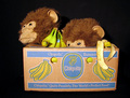
You keep watch while I....mrmph...by BeeCeeComment by Bear_Music: This is sort of a transitional image for you, in your small portfolio. I look at the dates on your various entries, and I see such rapid improvement! I'm sure by now you're aware how relatively unsophisticated the lighting is in this shot, and wish you could do it again. I'd make particular note that the pure black surround is not an ideal one for this subject, and that you have a vague "glare" on the box itself that is hurting you. That's the wax overlay on the cardboard carton, I believe. Some sort of coating anyway. It is possible that a polarizing filter would solve that problem; they work to some degree even with artifical light. |
| Photographer found comment helpful. |
| 04/29/2006 02:59:32 PM |
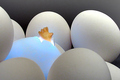
Genesisby BeeCeeComment by Bear_Music: Again, a fine concept and a very decent image. I might have tried to avoid the strict horizontal lineup of eggs across the top. As others have noted, the not-all-blue egg is a bit of a problem also. I wonder if actually PAINTING the egg with a wash of food color would have helped? That said, this is overall very competent work, and very imaginative as well. I like it! |
| Photographer found comment helpful. |
| 04/29/2006 02:56:42 PM |
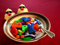
Alphabet Soup with Quackersby BeeCeeComment by Bear_Music: This image has many strengths, not least among them the absolutely gorgeous lighting on the flatware. I mean, really! Conceptually, it's also very strong. What I do NOT like as much is the desaturated-looking yellow of the duckies, and their unnatural beak color. I have a couple duckies like that, and they are hard to shoot. I have a couple other duckies that are much MORE yellow, and they are a joy to work with.
Finally, the BG itself is unfortunately quite uninspired, a rather insipid color and very flatly-lit. If it were advanced editing, you could solve it by burning in from the upper right along both edges with a gradient, but that wasn't an option here. Better control of your light would have done the trick, to allow the BG to shade off to dark upper left; a "pool of light" as it were... |
| Photographer found comment helpful. |
| 04/29/2006 02:52:00 PM |
untitledby BeeCeeComment by Bear_Music: I am actually getting to like your style. I'm glad you asked us to take a look, I've never studied your portfolio before. There's nothing I can "recommend" to "improve" this shot. I mean, sure, there's a zillion ways it mighthave been done and arguably some might have scored better, who knows? But this is very dynamic and luminous and just an all-around handsome shot. I like the tonal progression of it especially, as articulated by the diagonal shift from dark to light and shadow to luminance (not the same thing). Good one! |
| Photographer found comment helpful. |
| 04/29/2006 10:54:43 AM |
|
| Photographer found comment helpful. |
Home -
Challenges -
Community -
League -
Photos -
Cameras -
Lenses -
Learn -
Help -
Terms of Use -
Privacy -
Top ^
DPChallenge, and website content and design, Copyright © 2001-2025 Challenging Technologies, LLC.
All digital photo copyrights belong to the photographers and may not be used without permission.
Current Server Time: 04/18/2025 05:41:10 AM EDT.