| Image |
Comment |
| 03/15/2007 09:42:07 PM |
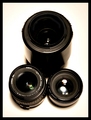
Ultimate Circleby pamelasueComment by S_Lanterman: I certainly get the circle aspect of the photograph, however I find it just a bit too cliche and predictable for my taste.
Perhaps a more macro version, where it didn't look so much like an ad for Canon lenses? Maybe focusing on the negative space made where the three lenses touch, yet still retaining some portion of the round-ness of the lenses? |
 Photographer found comment helpful. Photographer found comment helpful. |
| 03/15/2007 02:34:30 PM |
|
| 03/15/2007 02:13:57 PM |
Tick Tockby pamelasueComment by Badger: I think this would be improved without the shadow to the left, and with more balanced light on the face - the slight glare to the top right is a little distracting for me. |
| Photographer found comment helpful. |
| 03/15/2007 12:10:28 AM |
|
| Photographer found comment helpful. |
| 03/14/2007 11:08:02 PM |
Tick Tockby pamelasueComment by BlueZamia: This is a good product shot, but the centered placement makes it less interesting than it could be. |
| Photographer found comment helpful. |
| 03/14/2007 12:01:52 PM |
Cosmotiniby pamelasueComment by Artifacts: Originally posted by pamelasue:
 |
Positives:
Simple and to the point. Center framing works with this image and theaddition of the color with the lime is a nice touch.
Technicals:
Lack of digital artifacts is a strength. The background is not solid white but the amount of detail it does have works. Exposure is average with a slight bit of edge loss on the lower stem and base. Though not a hard and fast rule you almost always want to have a discernible edge all the way around your main subject.
Though it has no digital artifacts the image comes across as slightly soft focused which affected its score. There is a curved band-like reflection in the red liquid that confuses the viewer since they want to know what it is but cannot figure it out. It acts as a distraction.
In an image like this being level is critical. It needs to be rotated clockwise slightly.
The challenge:
This type image has become cliche at DPC and you certainly suffered scorewise from that. Not to say you should not submit this type of image, but when you do you have to be 100% certain that it has absolutely no technical defects whatsoever. It has to be PERFECT! |
| Photographer found comment helpful. |
| 03/14/2007 11:54:20 AM |
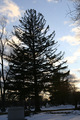
Companionsby pamelasueComment by GeneralE: I think your silhouette may have been more effective if there was less "stuff" in the background, which now fill the spaces between the branches where the sunset could show through. Perhaps moving a bit to the left from where you took this might have shown the main tree against a more open area. Also, lack of a clear horizon makes this look as though it's tilted counter-clockwise, even though the man-made structures(?) seem to show that you had the camera level. |
| Photographer found comment helpful. |
| 03/13/2007 06:36:30 PM |
|
| Photographer found comment helpful. |
| 03/12/2007 05:29:03 PM |
|
| Photographer found comment helpful. |
| 03/11/2007 11:13:04 PM |
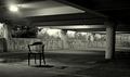
interrogationby pamelasueComment by ltlmschrisss: for the name of the photo I would have gone up closer to the chair with the light, shadow, and the puddle that is on the garage floor and had less of the garage. 6 |
| Photographer found comment helpful. |
Home -
Challenges -
Community -
League -
Photos -
Cameras -
Lenses -
Learn -
Help -
Terms of Use -
Privacy -
Top ^
DPChallenge, and website content and design, Copyright © 2001-2025 Challenging Technologies, LLC.
All digital photo copyrights belong to the photographers and may not be used without permission.
Current Server Time: 04/07/2025 08:49:01 AM EDT.