| Image |
Comment |
| 01/24/2003 10:20:05 AM |
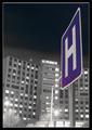
"Rising Healthcare"by KickDrum5150Comment by carsten: This is a very good composition but I´m not so sure about the focus. Focus on the sign is OK. I know it´s hard to take this kind of photos so I think you have done a great job. Hgh score from me. |
| 01/23/2003 07:06:06 PM |
"Rising Healthcare"by KickDrum5150Comment by Silver Fox: Love your night shot. The Blue and White sign against the Dark Sky with the Greyness of the Hospital and the lights shining from the parking lot. Great shot. |
| 01/23/2003 05:58:29 PM |
|
| 01/23/2003 02:59:40 PM |
|
| 01/22/2003 10:24:38 PM |
|
| 01/22/2003 04:09:56 PM |
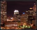
"Manned Scape"by KickDrum5150Comment by jimmyn4: Greetings from the Critique Club.
First off. Nice title and nice photo for the challenge. People who live in cities were at a disadvantage for this challenge and I think you met the challege the best you could.
First off I like the star effect you got with some of the lights. Looking that you had a 25 sec exposure time with an f/10 suggests that a smaller aperture created the star like affect un less of course you used a star effect filter. It worked well either way. You should also consider yourself lucky to have a camera that can do low ISOs. Much to popular belief it is wiser to use a lower ISO for low light shots than a larger one. There is hardly any noise in this picture. The composition is very nice and I like how you have the tall buildings step down to the smaller one in the middle. I think the only thing I would improve with this photo is the focus. Focusing at night is very difficult if this photo were a little sharper it would be better in my eyes. Good work and good luck with future challenges. |
| 01/22/2003 08:44:58 AM |
|
| 01/21/2003 05:09:05 AM |
|
| 01/20/2003 07:23:29 PM |
|
| 01/20/2003 06:17:00 PM |
"Rising Healthcare"by KickDrum5150Comment by PTLParsons: Strange. The hospital appears out of kelter, at least with the sign, like it's leaning a little. But the sign appears perfectly perpendicular. Must be the angle. Great title for this shot. It adds to this one. I also like the frame/border. It's a 6. |
Home -
Challenges -
Community -
League -
Photos -
Cameras -
Lenses -
Learn -
Help -
Terms of Use -
Privacy -
Top ^
DPChallenge, and website content and design, Copyright © 2001-2025 Challenging Technologies, LLC.
All digital photo copyrights belong to the photographers and may not be used without permission.
Current Server Time: 03/12/2025 07:08:44 PM EDT.