| Image |
Comment |
| 01/20/2008 10:35:34 AM |
Keith 1by breadfan35Comment by bdenny: This one is great. I wish you could've entered it in the challenge. It would've done very well, I'm sure! The lighting is excellent, as is the DOF. Very well done! |
 Photographer found comment helpful. Photographer found comment helpful. |
| 01/20/2008 10:33:18 AM |
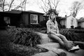
Boring Afternoon IIby breadfan35Comment by bdenny: This one, overall, is less effective, I think, in portraying boredom. B&W would be better. In the first image, her jacket was very contrasty, which immediately attracted the eye. Here it is less contrasy. Additionally, the basketball goal is distracting as well. But that's easily cloned out. And I like her pose better in this one than the first one. She looks really bored here. |
| Photographer found comment helpful. |
| 01/20/2008 10:29:56 AM |
Boring Afternoonby breadfan35Comment by bdenny: I think the composition and general 'feel' of the picture is great. The title certainly accentuates the feeling. The only thing I'd change would be to darken the farthest house (the white one). It sort of draws the eye away from your subject. But the B&W works very well, makes it seem more dreary. |
| Photographer found comment helpful. |
| 01/20/2008 10:12:01 AM |
Boring Afternoonby breadfan35Comment by Quasimojo: I like the shot but personally I'd either have sharpened up the house by closing down a bit, or blown it all out by opening up a bit...but in between is neither, in that she's in focus but the house isn't - but it is enough in focus to distract from the subject. I like the composition a lot...the tones are really nice and it works well in contrasty b&w. |
| Photographer found comment helpful. |
| 01/20/2008 06:47:05 AM |
Keith 1by breadfan35Comment by emlbaker: Third image, third comment.
Nice image. Not sure if this might have been better just that bit further away in composition to include the top of the subjects head. You stated that you had done a little bit more processing than that allowable in basic. A couple of things (very picky) that could be cloned out of this shot is the bright hair in the beard (the one stray white hair on the shadowed side of his face, just below the bottom lip) and the fly-away hair just near the ear on the right side of his head (shadowed side).
I dont think that I could possibly find anything else in this shot. Sorry that it is not that in-depth, |
| Photographer found comment helpful. |
| 01/20/2008 06:34:34 AM |
Boring Afternoon IIby breadfan35Comment by emlbaker: Another comment after your request in the thread.
A similar shot to the first, and to be honest I think that this one might have been the better of the two for black and white due to the tigher crop. You have a darker background here, with very little on the light side in it, while your subject is fairly well lit and would convert relatively light in black and white. We generally see a single subject staring off in to the distance with room on the side that they are looking too. At first glance, I got the impression that she heard a commotion down the street and had turned that way to see what it was.
Even though I think that it would be the better of the two for black and white I still like the tones used in this shot. |
| Photographer found comment helpful. |
| 01/20/2008 06:29:08 AM |
Boring Afternoonby breadfan35Comment by emlbaker: As requested in your thread, here are my thoughts on this shot.
I like the overall feel of the shot and the choice of black and white processing works well. There is something about the tree in the back right corner that keeps grabbing my attention away from your subject. Have you had a look at this with a tight crop around the girl only, as there is really not all that much in the background to support your main subject IMHO. A tighter crop would still leave you with the white house, hence leaving the viewer with the impression that the subject is sitting at the front of the house.
Nice work
|
| Photographer found comment helpful. |
| 01/15/2008 11:41:20 PM |
|
| Photographer found comment helpful. |
| 01/13/2008 02:41:36 PM |
|
| Photographer found comment helpful. |
| 01/10/2008 03:53:00 PM |
|
| Photographer found comment helpful. |
Home -
Challenges -
Community -
League -
Photos -
Cameras -
Lenses -
Learn -
Help -
Terms of Use -
Privacy -
Top ^
DPChallenge, and website content and design, Copyright © 2001-2025 Challenging Technologies, LLC.
All digital photo copyrights belong to the photographers and may not be used without permission.
Current Server Time: 04/19/2025 02:43:30 AM EDT.