| Image |
Comment |
| 02/24/2003 03:43:27 PM |
|
 Photographer found comment helpful. Photographer found comment helpful. |
| 02/24/2003 02:37:06 PM |
|
| Photographer found comment helpful. |
| 02/24/2003 02:27:41 PM |
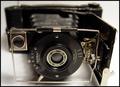
Art Never Agesby VisionComment by PTLParsons: Wish you had flipped this to the portrait position so the face of the camera could be read. Also would have preferred who camer in focus on this shot. Would be a 10 with these 2 changes. The rest of the photo is good. |
| 02/24/2003 02:25:38 PM |
|
| Photographer found comment helpful. |
| 02/24/2003 02:16:26 PM |
|
| 02/24/2003 01:53:32 PM |
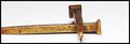
His Despair Our Gainby VisionComment by f-32: Interestingly conceived and done. I must admit that I would prefer to have all of the horizontal spike showing, and IMHO the cross-lying top spikeshould be in focus at the sharp end rather than the head. An extremely good concept on the 'despair' theme, though! |
| Photographer found comment helpful. |
| 02/24/2003 01:25:29 PM |
Art Never Agesby VisionComment by rmahan: I don't think I ever tire of seeing old cameras -- especially bellows models. Since all of the writing on the camera goes the same way, I'd like to see the camera standing up rather than laying down. The viewfinder would be the correct way then, too. I would try to put the entire front lens in focus by giving just a slight bit more DOF. It's a very nice image and could be used to illustrate many things in the stock photography world. |
| 02/24/2003 11:43:06 AM |
Art Never Agesby VisionComment by emorgan49: Because of the lettering, it should stand up the other way. People like to look at words right side up. |
| 02/24/2003 11:18:29 AM |
|
| Photographer found comment helpful. |
| 02/24/2003 09:29:14 AM |
Art Never Agesby VisionComment by xertion: The choice of subject is very interesting and the focusing adds a lot to the shot. I do wish the lighting were better as the odd shadows take away from the picture. 10! - xertion |
Home -
Challenges -
Community -
League -
Photos -
Cameras -
Lenses -
Learn -
Help -
Terms of Use -
Privacy -
Top ^
DPChallenge, and website content and design, Copyright © 2001-2025 Challenging Technologies, LLC.
All digital photo copyrights belong to the photographers and may not be used without permission.
Current Server Time: 03/13/2025 09:20:38 PM EDT.