| Image |
Comment |
| 05/15/2006 10:10:23 AM |
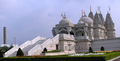
mosqueby ColonolComment by djflo: A grand building. A shame the sky wasn't kinder to you on the day. I think it may have helped by cropping the chimney out of the left side of this pic and maybe squaring the horizon too. |
 Photographer found comment helpful. Photographer found comment helpful. |
| 05/14/2006 12:53:43 AM |
mosqueby ColonolComment by men_do: the photo is good but please be informed that this a Hindu temple not a mosque. |
| Photographer found comment helpful. |
| 05/13/2006 06:22:37 PM |
mosqueby ColonolComment by RolandB: Good exposure, but the horizon needs to be leveled. (Let the structure on the left be tilted.) |
| Photographer found comment helpful. |
| 05/13/2006 04:26:45 PM |
mosqueby ColonolComment by robs: I think you need to straighten up the building for the viewer. |
| Photographer found comment helpful. |
| 05/12/2006 07:23:59 PM |
mosqueby ColonolComment by TheStick: Image is a little on the small size. I'd suggest cropping a little more off the left side. The smoke stack (?) does nothing but distract IMHO |
| Photographer found comment helpful. |
| 05/12/2006 01:36:49 PM |
mosqueby ColonolComment by scalvert: Very cool subject, with good color and detail. I'm sure you already have comments about the rotation- it's not enough to appear intentional and too much to appear normal. Pity you couldn't find another angle or at least crop out the distracting smokestack. |
| Photographer found comment helpful. |
| 05/12/2006 08:54:02 AM |
|
| Photographer found comment helpful. |
| 05/11/2006 08:40:28 PM |
mosqueby ColonolComment by Plachoochi: Beautiful subject and you have done well to not overexpose. I would like to see a different perspective or a tighter crop to remove the object on the left of the photo. I find that the object pulls my eye away from the mosque. |
| Photographer found comment helpful. |
| 05/11/2006 05:44:10 PM |
|
| Photographer found comment helpful. |
| 05/11/2006 12:09:02 PM |
mosqueby ColonolComment by KarenNfld: An amazing building, shame you didn't make sure your photo was straight (a slight rotation is all it needs). Composition could be improved by cropping out the tall smoke stack on the left and maybe even getting closer to show us some of that amazing architecture. You don't have to fit the entire building into the photo, sometimes a closer look is better. |
| Photographer found comment helpful. |
Home -
Challenges -
Community -
League -
Photos -
Cameras -
Lenses -
Learn -
Help -
Terms of Use -
Privacy -
Top ^
DPChallenge, and website content and design, Copyright © 2001-2025 Challenging Technologies, LLC.
All digital photo copyrights belong to the photographers and may not be used without permission.
Current Server Time: 03/14/2025 01:43:38 PM EDT.