True Northby
snafflesComment by JamesDowning: Hello from the Critique Club.
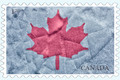
Susan, honestly I'm not excited by this challenge in general. What looks good on a stamp doesn't necessarily look good at 800 x 1200. This might have been a good challenge to view from my phone.
I agree with the other members. The image is simple and appropriate for a stamp, but I really think the large image sizes worked against you. When I open your image by itself and zoom out to about 25%, I start to like your image more, but I do lose the taupe border around the leaf, which was a key design element I think that added some extra interest. Additionally, the text becomes a bit small proportionally, although at full size the text feels big. If the challenge creator had some forethought, they should have made an additional rule to require images to be 300 pixels max. Anyway, enough griping.
I like the sparkly background, but wouldn't have known what it was without really reading your description. Again, it looks even better in the size that a stamp should be.
Some final thoughts, You have a border around the stamp edges, but not around the stamp background. It looks a little off because of that. I'd suggest putting a border on both, or neither.
Hope you found a little insight here for this unconventional challenge. Cheers.
-James