| Image |
Comment |
| 04/07/2003 04:58:46 PM |
|
| 04/07/2003 01:09:43 PM |
|
| 04/07/2003 01:07:58 PM |
|
| 04/07/2003 10:12:12 AM |
|
| 03/15/2003 10:37:21 PM |
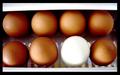
odd one outby quicksand84Comment by karmat: CRITIQUE CLUB CRITIQUE
by karmat
COMPOSITION
Though the horizontal placement of eggs gives the picture a solid, stable feeling, it also makes it kinda static. There is nothing to lead the eyes through the picture; they just go to the white egg and stop. I think a tighter crop to remove the white at the top and bottom, or to even it up would have been effective, or arranging the eggs differently, maybe in a cluster instead of rows.
TECHNIQUE
It seems slightly overblown on the white. Maybe a diffuser, or something like a tissue or paper towel (make sure it doesn't ignite!) over your primary light source would help.
OVERALL EFFECT
I think this is a potentially awesome shot. The white adn brown provides a neat contrast, and it does meet the challenge.
Best wishes in the future.
karmat
|
| 03/08/2003 01:50:16 PM |
odd one outby quicksand84Comment by dsidwell: Wonderful idea, and the contrast between the brown and white works well. The lighting is appropriate, too. The white egg seems out of focus, when I think that's the one you really want in focus. |
| 03/05/2003 02:08:54 PM |
|
| 03/03/2003 10:49:32 PM |
odd one outby quicksand84Comment by dacrazyrn: picture ended up a litle noisy, not sure from USM or just getting it to size for the challenge. white egg has too bright of light on it, but that is a tough one with white and dark eggs |
| 02/09/2003 07:55:54 PM |
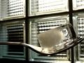
liquefied squareby quicksand84Comment by timj351: Critique Club critique
I'm a little late getting to this critique but here it goes.
Somebody commented that the background and the foreground are competing visually with each other and I agree with this. I think it would have significantly helped to try to blur the background somewhat. This could have been achieved by moving the fork and ice cube farther away from the window and trying to position the camera even closer to the fork. You're right, the ice cube is not very square but it easily could have been. It should have been easy enough to create a perfectly square cube of ice either with a square container or by shaping it afterwards. I would have liked to see this abstracted more by really concentrating on the composition. As it is I feel that the overall design and composition are not very strong. I think it would have been more effective to see a strong design first and then to see that it is an ice cube on a fork, second. Maybe the ice cube could have been positioned to fit exactly in one of the squares in the window or maybe the fork could have crossed the image at an interesting angle. What if you had frozen the ice cube around the prongs of the fork so that it appeared like you picked up the ice cube with the fork? The image is very clean and sharp and the colors are good. You have plenty of squares in the scene so that it easily meets the challenge. The idea is an intersting one. I just feel that it needs to be stronger compositionally and conceptually.
T |
| 02/08/2003 10:49:38 PM |
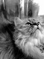
meowby quicksand84Comment by Olyuzi: Very nice composition. I like the format chosen and the pose of the cat. In addition, I like the texture of the cat oppsoing the texture of what ever's on top (window?). |
Home -
Challenges -
Community -
League -
Photos -
Cameras -
Lenses -
Learn -
Help -
Terms of Use -
Privacy -
Top ^
DPChallenge, and website content and design, Copyright © 2001-2025 Challenging Technologies, LLC.
All digital photo copyrights belong to the photographers and may not be used without permission.
Current Server Time: 03/12/2025 10:23:58 PM EDT.