| Image |
Comment |
| 06/19/2011 04:38:06 PM |
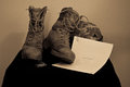
Last Night at Homeby ogremerkComment by Revecca: Concept is excellent. A tighter crop would help. Also, an all black background would've made the items stand out a lot more, than against the wall. Also, since we can't READ what's on the papers, I think having the helmet on top of the papers would've been better. |
 Photographer found comment helpful. Photographer found comment helpful. |
| 06/16/2011 03:45:14 PM |
|
| 06/15/2011 11:46:39 PM |
Last Night at Homeby ogremerkComment by tanguera: That just plucked my heartstrings. But I wish a little more effort would have been put into selecting a surface/background. And just a tad more contrast.... |
| Photographer found comment helpful. |
| 06/15/2011 03:57:00 AM |
|
| 06/15/2011 12:37:40 AM |
|
| Photographer found comment helpful. |
| 03/24/2009 12:26:18 AM |
|
| Photographer found comment helpful. |
| 03/23/2009 04:23:25 PM |
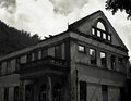
Crawford's Covalescent Homeby ogremerkComment by retiredPhil: I took the dark building to be "fading into the past". The typo in the title made me make sure there is no "covalescent", but that's a bit of a personal problem, I'll try to convalesce. The part under the balcony could have had some light shed on it. |
| Photographer found comment helpful. |
| 03/23/2009 02:42:22 PM |
|
| Photographer found comment helpful. |
| 03/22/2009 12:55:21 AM |
|
| Photographer found comment helpful. |
| 03/21/2009 11:40:13 AM |
|
Home -
Challenges -
Community -
League -
Photos -
Cameras -
Lenses -
Learn -
Help -
Terms of Use -
Privacy -
Top ^
DPChallenge, and website content and design, Copyright © 2001-2025 Challenging Technologies, LLC.
All digital photo copyrights belong to the photographers and may not be used without permission.
Current Server Time: 03/10/2025 09:54:43 PM EDT.