| Image |
Comment |
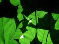
| 07/02/2004 04:07:46 PM |
Leaf Abstractby WildpurpleComment by Cantique: Excellent use of light and shadow. On my PC this was a bit too dark in the shadows but on my mac I can see all of the detail and it adds to the effect. The part I find a bit distracting is the white parts which are a bit too bright on my mac which is the computer I'm entering this comment from. It is so difficult to know what to put into an online image with different monitors involved. I like this one very much from all my monitors. |
 Photographer found comment helpful. Photographer found comment helpful. |
| 07/02/2004 10:03:11 AM |
Potato Bugby WildpurpleComment by graphicfunk: from the Critique Club:
This is a very clever idea and if I squint my eyes I appreciate it even more. In other words, you have a very good picture with a nice green foreground color. However, when you color a foreground, the eye wants to see it sharp, otherwise the eye has to get past it and to the subject, but returns back to the green to find a lot of fuzzy edges.
As you may have learned when you retain a color and desaturate the rest, your first problem is to find the true line of demarcation. If the image is not in focus then this problem invites you to judge where the fence begins and ends. There is no software available which will make this decision without either keeping or throwing information away. This makes your job very difficult with this image since you selected the fence. Of course, I can say why not the leaf?, but then it would not have the same impact. Again, I like the idea because as is it imparts a feeling that the viewer is peeking right behind the fence and I am certain that this image stands on its own without the color. The color gives it charm, but the viewer is left giving the color a second thought. So: great picture without the color if we discount the spirit of the challenge. dan
|
| 07/02/2004 02:50:32 AM |
|
| Photographer found comment helpful. |
| 07/02/2004 12:06:27 AM |
The Moon Studioby WildpurpleComment by scalvert: OK, that's just scary. I admire your daring approach, but it's just too over the top for me. Not quite the "formal studio portrait" that I think many are expecting here. It might have worked better with a good exposure turned into a duotone, but this looks like it's reversed and solarized and the result is... well, weird. |
| Photographer found comment helpful. |
| 07/01/2004 11:27:02 PM |
The Moon Studioby WildpurpleComment by L1: This image is just a bit to artsy for my taste, especially when considering a color studio portrait...it isn't really what comes to mind. Interesting lighting and effect, however. :o) |
| Photographer found comment helpful. |
| 07/01/2004 06:34:22 PM |
Got pink?by WildpurpleComment by airatic: I hope that's not natural, I don't want any mutant crickets in my house :) Nice and sharp, but a bit too dark, the cricket looks like it's floating in front of the bar rather than standing on it. I like the detail you captured in the cricket's body. |
| Photographer found comment helpful. |
| 07/01/2004 05:09:11 PM |
|
| Photographer found comment helpful. |
| 07/01/2004 10:00:45 AM |
|
| Photographer found comment helpful. |
| 07/01/2004 07:00:25 AM |
|
| Photographer found comment helpful. |
| 07/01/2004 03:54:22 AM |
|
| Photographer found comment helpful. |
Home -
Challenges -
Community -
League -
Photos -
Cameras -
Lenses -
Learn -
Help -
Terms of Use -
Privacy -
Top ^
DPChallenge, and website content and design, Copyright © 2001-2025 Challenging Technologies, LLC.
All digital photo copyrights belong to the photographers and may not be used without permission.
Current Server Time: 04/18/2025 09:44:43 PM EDT.