| Image |
Comment |
| 07/20/2012 06:57:22 AM |
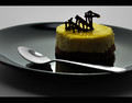
The Loch Ness Pastry Monsterby wejnaComment by Skip: This is a tough challenge to vote. I'm torn between "what are you trying to do here" and "what do I expect here". Further complicating matters is the question "what would I do here".
What I would expect would be a technically strong piece of eye-candy that would present the dessert in a way that I would want to at least sample it, if not order it. Along these lines I'm looking at technicals: backgrounds, distracting elements, exposure, sharpness. I'm also looking for creativity, imagination, and originality, which can make up for less than perfect technicals.
So, where does this leave me with your image?
Simply beautiful. I wouldn't do much else, except to print it off and hang it on a wall. And *maybe* (just my personal opinion here), try to bring out just a little more detail in the shadows; not much, just a little. |
 Photographer found comment helpful. Photographer found comment helpful. |
| 07/19/2012 11:22:09 PM |
|
| Photographer found comment helpful. |
| 07/19/2012 07:13:22 PM |
The Loch Ness Pastry Monsterby wejnaComment by FtWorthphotog: It's all in how you look at it :) funny my wife walked in while I was voting and goes.."look its Nessy." I told her she was nut then scrolled down and saw the title and had to laugh. Funny story aside, this shot is nice enough reflections are decent and the lighting is Ok I personally would have gone a wee bit brighter but there is nothing inherently wrong with the brightness. Overall nice shot imo and thanks for the laugh. |
| Photographer found comment helpful. |
| 07/19/2012 03:51:40 PM |
|
| Photographer found comment helpful. |
| 07/19/2012 01:43:19 PM |
|
| Photographer found comment helpful. |
| 07/19/2012 11:37:24 AM |
|
| Photographer found comment helpful. |
| 07/18/2012 11:44:53 PM |
The Loch Ness Pastry Monsterby wejnaComment by unbreakable: excellent use of light and black. one of my favorites. smart border choice. My only (and very minor) criticism would be to have used a true silver spoon or one without water spots. the spoon looks streaky on my monitor which compared to the absolutely pristine shininess of everything else...Still, that being said 10 |
| Photographer found comment helpful. |
| 07/18/2012 03:04:58 PM |
The Loch Ness Pastry Monsterby wejnaComment by CNovack: Voted earlier coming back to comment.
I love the presentation, the colors, the the word play on this dessert entry. The chocolate topping on the lemon colored cake does look like Nessie! The yellow of the cake just pops visually off of the black plate. I also love how the spoon is added into the composition that basically invites us to reach down and take a bite out of this dessert. My only critique is that I wish the lighting was a little more even to provide a bit more illumination and detail of the front half of the treat. As it is now, it rests a bit too much in the shadow - show us more of those lovely yellow and tasty details. |
| Photographer found comment helpful. |
| 07/18/2012 12:27:26 PM |
The Loch Ness Pastry Monsterby wejnaComment by JamesDowning: Of the pictures in this challenge, this is certainly one of the better composed images. Spoon leads you in, cake is simple and appealing, nice simple backdrop and plate... I imagine this as a winner. |
| Photographer found comment helpful. |
| 07/18/2012 10:00:30 AM |
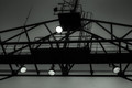
Modern day watchtowerby wejnaComment by Cory: Strange. I don't know that it screams technology, but it's not bad either. My concern is the overall composition, why is this laid out like it is, why not symmetrical? Why not more context? |
| Photographer found comment helpful. |
Home -
Challenges -
Community -
League -
Photos -
Cameras -
Lenses -
Learn -
Help -
Terms of Use -
Privacy -
Top ^
DPChallenge, and website content and design, Copyright © 2001-2025 Challenging Technologies, LLC.
All digital photo copyrights belong to the photographers and may not be used without permission.
Current Server Time: 04/17/2025 03:08:14 AM EDT.