Off The Beaten Path
by
ColeyComment by Garry: *** Critique Club ***
Hi Coley. With a score of 6.9xx and a placing of 2nd, not too sure what I can say that the numbers don't already say.
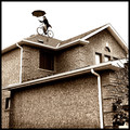
I'll start by saying this really is a fantastic image. Incredibly unique and creative and clearly this resonated with the voters. The composition is strong, the processing with the toning is nicely done, and the execution is great. Where this image fell short for me, though, was the exposure and focus. The building is perfectly exposed, which is important considering the proportion of the frame it takes up. However, the bike and the rider are a touch over-exposed, and there's a loss of detail there. I can't see the front forks, handlebars, spokes etc or the umbrella shaft. Not sure if this was from the exposure of the picture itself, or as a result of the processing required to turn the sky white? Since the challenge was all about "bikes", I felt this lack of detail in the bike itself was a shortfall. Likewise, while the building is exceptionally sharp (those bricks are killer!), I found the bike and biker to be quite soft, with little definition and detail in the bikers face.
Clearly, these "criticisms" didn't impact the voters at all, and the image score highly as to be expected. Hopefully my viewpoint has some merit and the critique provided something worthwhile for you.
Feel free to PM me if you'd like to discuss anything I've written about!
Kind regards,
Garry