| Image |
Comment |
| 06/17/2003 07:54:32 PM |
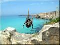
House Beautifulby giampoComment by danh669: House Beautiful magazine? Can't say I'm familiar with that one. Awesome picture though, barely looks real. |
| 06/17/2003 10:54:21 AM |
House Beautifulby giampoComment by Kavey: I really hate spiders but this is such a superb image that I'm still giving it a 10. I often like shallow DOF but here it just blows me away - a perfect choice. It creates what looks like a painting behind the web and really evokes the idea of a home in the sunny mediterranean or caribbean. |
 Photographer found comment helpful. Photographer found comment helpful. |
| 06/16/2003 10:42:03 PM |
House Beautifulby giampoComment by Bitz: I'm not sure I understand the connection of the photo with the title of the magazine, House Beautiful - ??? Technically, this is quite good. |
| 06/16/2003 02:41:59 PM |
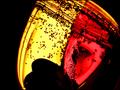
Heart's glueby giampoComment by HBunch: *Critique Club*
I'm not really sure what I think about this. I think that the little pieces of confetti floating around (or stuck in it, either way) are very neat.
It's all about the colors and shapes though. It doesn't LOOK liquid I guess is what I'm saying. Had not been for the bubbles in the top of the cup, it might have been very difficult to tell.
The colors are nice, and focus and clarity are right on. Nice sharp lines in the heart, and lots of clear confetti.
The smudged area on the red side near where it meets the yellow is a bit distracting. I don't know if I like that part at all.
The crop does seem a little strange too. I wonder if this should either be all in the frame, or more out of the frame. one extremem or the other.
Overall, it's a calming photo to look at.
~Heather~ |
| 06/14/2003 01:03:42 PM |
House Beautifulby giampoComment by kyrielle: A lovely spider - a nature-themed magazine might have been more appropriate, though, especially considering the backdrop. |
| 06/13/2003 03:31:03 AM |
|
| Photographer found comment helpful. |
| 06/13/2003 02:00:27 AM |
House Beautifulby giampoComment by f-32: I love the photo - just think it might not fit the needs of that particular magazine... btw, the orientation means little - not all mags have one shot, full bleed to the edges. |
| Photographer found comment helpful. |
| 06/12/2003 08:19:19 PM |
|
| Photographer found comment helpful. |
| 06/12/2003 08:14:38 PM |
House Beautifulby giampoComment by qachyk: House Beautiful = interior design magazine. This = at best a poor pun.
If you were going to do a pun like this, you should have found a more attractive spider web. The background looks attractive but as the focal point is on the spider and web and the background is blurred that doesn't much help.
Better still, if you wanted to enter this shot into this particular challenge, you should have found a magazine that might have accomodated it. I would have thought more highly of it. I don't care for spiders and if I look at a web I'd like it to be pretty and iridescent but I would at least have felt it was truly on topic. |
| Photographer found comment helpful. |
| 06/12/2003 06:33:23 PM |
House Beautifulby giampoComment by Inga_fang: more like web beautiful :)...gosh I wouldn´t want to c this one up close, great colors, great shot...a really good job |
| Photographer found comment helpful. |
Home -
Challenges -
Community -
League -
Photos -
Cameras -
Lenses -
Learn -
Help -
Terms of Use -
Privacy -
Top ^
DPChallenge, and website content and design, Copyright © 2001-2025 Challenging Technologies, LLC.
All digital photo copyrights belong to the photographers and may not be used without permission.
Current Server Time: 03/12/2025 08:13:39 PM EDT.