| Image |
Comment |
| 01/27/2008 01:38:28 AM |
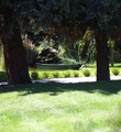
Suburban Oasisby Pick001Comment by Yo_Spiff: Comp does not really seem to work. I'd suggest cutting off a lot of the grass and a bit of the treetops. |
| 01/26/2008 11:08:56 AM |
|
| 01/25/2008 01:57:42 PM |
|
| 01/25/2008 12:35:19 PM |
|
| 01/23/2008 05:53:45 PM |
Suburban Oasisby Pick001Comment by LMA128: i think this would have a better overall effect if it was cropped in a little more (my opinion)...but still a good shot. |
| 01/23/2008 10:11:58 AM |
|
| 01/23/2008 07:46:15 AM |
Suburban Oasisby Pick001Comment by thierr26: Nice place. I think that composition could have been improved. The grass in the foreground takes too much space in the image. |
| 01/23/2008 06:31:38 AM |
Suburban Oasisby Pick001Comment by hajeka: I like the composition, but the foreground is very light. Think it would be nice is you cropped away the foreground and let the trees and the shadows frame your photo. |
| 01/18/2008 03:35:46 PM |
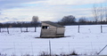
Lonely Shackby Pick001Comment by bassbone: i like the desolate feel of the sky and the snow, but the centered composition makes this seem far too static |
| 01/17/2008 01:48:25 PM |
Lonely Shackby Pick001Comment by JaimeVinas: I see so much potential for this one if it were cropped right so that the house wasnt centered and then converted into black and white by manipulating the blues to be darker and reds and yellows lighter. It would be very dramatic. |
Home -
Challenges -
Community -
League -
Photos -
Cameras -
Lenses -
Learn -
Help -
Terms of Use -
Privacy -
Top ^
DPChallenge, and website content and design, Copyright © 2001-2025 Challenging Technologies, LLC.
All digital photo copyrights belong to the photographers and may not be used without permission.
Current Server Time: 03/12/2025 10:43:44 AM EDT.