| Image |
Comment |
| 05/04/2008 04:03:58 PM |
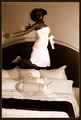
Jumperby Joker1114Comment by PapaBob: She should know better than jumping on the bed:) The lighting for the shot just does not do her justice, A little more lighting on the face would be nice and getting rid of the shadows behind her head by adding background light to light the wall behind her may have helped. |
 Photographer found comment helpful. Photographer found comment helpful. |
| 05/01/2008 09:04:20 PM |
|
| Photographer found comment helpful. |
| 04/30/2008 05:09:22 PM |
Jumperby Joker1114Comment by epescala: You need better lighting for this. More fill flash. The shadow in the wall is very harsh, and there is no detail in her face. Also I dont like the angle. |
| Photographer found comment helpful. |
| 04/30/2008 03:51:39 PM |
Jumperby Joker1114Comment by timwest167: Harsh lighting (shadow on bed and wall) but the subject's face is not very well lit. |
| Photographer found comment helpful. |
| 04/30/2008 01:56:02 PM |
Jumperby Joker1114Comment by albc28: Too dark....you lose alot of details int he face. You should light up at her face to fill in the shadows. |
| Photographer found comment helpful. |
| 04/30/2008 06:48:40 AM |
Jumperby Joker1114Comment by choltmeier: I love the concept and the contrast. I wish the face had a little more light to see more of the expression. |
| Photographer found comment helpful. |
| 04/30/2008 04:23:28 AM |
Jumperby Joker1114Comment by ShutterPug: The lighting was poorly aimed resulting in some undesirable shadows. As for the composition, it would have been better to follow the rule of thirds here, instead of centering the model. Some fill light would have lit up the face better and showed more expression. |
| Photographer found comment helpful. |
| 04/09/2008 03:00:49 PM |
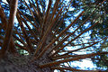
Tree of Lifeby Joker1114Comment by Haneck: A little less contrast, so the white tree isn't over-exposed, and perhaps a slightly different, more interesting pov (try moving the camera closer to the ground, perhaps) and I'll bet this would have scored better. The colors are vivid and powerful though - good work! |
| Photographer found comment helpful. |
| 04/06/2008 11:27:31 PM |
"From The Bottom Up"by Joker1114Comment by JulietNN: Well, wow, I am not sure what to say. For me personally, it is a little fussy. Now being a tree it can not exactly have its branches grown artistically. But maybe if you had choosen one or two branches to focus on the eye wouldnt be searching for a point to rest. I have many many shots of shooting up trees just like this one. |
| Photographer found comment helpful. |
| 04/04/2008 03:02:59 AM |
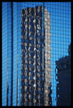
"Pattern with-in the Glass" by Joker1114Comment by h2: I voted this a 6, it's a good photo but nothing spectacular. Would have given a 7 if there wasn't the slight distortion visible at the left edge and the bold black border that seems to make the image darker than it is.
Besides that, have a lok at the ascores given to most ribbon winners (especially those with strong colors), they all get 1s, 2s and 3s. There's nothing you can do to stop those people. |
| Photographer found comment helpful. |
Home -
Challenges -
Community -
League -
Photos -
Cameras -
Lenses -
Learn -
Help -
Terms of Use -
Privacy -
Top ^
DPChallenge, and website content and design, Copyright © 2001-2025 Challenging Technologies, LLC.
All digital photo copyrights belong to the photographers and may not be used without permission.
Current Server Time: 04/11/2025 02:30:09 AM EDT.