| Image |
Comment |
| 05/27/2008 12:09:29 AM |
Battleship Coveby bobnospumComment by rinac: Impressive vessel, but overall, the composition is boring. Sometimes you have to ask yourself, "Is this really the best shot I've taken all month?", then add that to, "Would I hang this on my wall?" |
 Photographer found comment helpful. Photographer found comment helpful. |
| 05/27/2008 12:05:54 AM |
Stoneham Theatre, circa 1917by bobnospumComment by rinac: The only saving grace for me in this is the retro theatre. As others have pointed out, the lack of contrast was a mistake. You can make a photo look "noisy, old, and faded" without necessarily losing all contrast. Is "Old Photo, with motte" some sort of filter? |
| Photographer found comment helpful. |
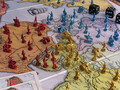
| 05/26/2008 11:59:00 PM |
Conquer the World (Risk)by bobnospumComment by rinac: Colours are good here, but definitely needs sharpening. I don't understand why you went to the trouble of setting up an elaborate scene, only to crop elements off abruptly around the frame... |
| Photographer found comment helpful. |
| 05/26/2008 11:55:06 PM |
Urban Four Squareby bobnospumComment by rinac: Not sure I can agree with the "underrated" comments here. I think it placed exactly where it should have. It's an average shot. It's a shot of a dirty and worn floor. Nothing excites me about this. I gave it a 5 and I'm usually a very generous voter. |
| Photographer found comment helpful. |
| 05/26/2008 11:51:46 PM |
Emergenceby bobnospumComment by rinac: Sometimes silly works, sometimes it doesn't. This is a case of when it doesn't. The digital noise is so much so that it appears as though jpeg compression artefacts from upsizing a small image. I find the tilt and angle a little disconcerting too. |
| Photographer found comment helpful. |
| 05/26/2008 11:47:12 PM |
|
| Photographer found comment helpful. |
| 05/26/2008 11:44:12 PM |
Playground Fenceby bobnospumComment by rinac: Not sure what to make of this. There's a fence alright, but I see no real point of interest anywhere in this image. Composition is all over the place and again, the colours seem flat and lifeless. |
| Photographer found comment helpful. |
| 05/26/2008 11:40:43 PM |
House of Mirrorsby bobnospumComment by rinac: Good patterns entry. I'm surprised no-one's mentioned that your colours are flat and it could do with a wee bit more sharpening. |
| Photographer found comment helpful. |
| 05/26/2008 11:37:31 PM |
|
| Photographer found comment helpful. |
| 05/26/2008 09:39:07 PM |
|
| Photographer found comment helpful. |
Home -
Challenges -
Community -
League -
Photos -
Cameras -
Lenses -
Learn -
Help -
Terms of Use -
Privacy -
Top ^
DPChallenge, and website content and design, Copyright © 2001-2025 Challenging Technologies, LLC.
All digital photo copyrights belong to the photographers and may not be used without permission.
Current Server Time: 04/18/2025 02:23:32 PM EDT.