| Image |
Comment |
| 04/22/2009 12:25:22 AM |
Floralby SoulComment by snaffles: Greetings from the Critique Club!
Initial reaction: I appreciate the effort behind this shot, looks like some of my earliest attempts here! There is a good effort at composition; you are using the rule of thirds, and there are some leading lines with the lower part of the pattern. Most of the right could be cropped out. Picture needs more of a focal point and a little more zing to it. I would have liked to see this in colour, and maxed out in terms of size.
Technical: I have the same lens that you used here so I know how much it can be pushed into drawing out detail! With an aperture of 5.3 you should be able to get all of the foreground and most of the background in focus. The lighting is flat and the b/w treatment only accentuates this aspect. 1/125 seems awfully fast, too; anywhere from 1/60 to 1/20 would probably have been enough. Try lighting from the side; you can make a rudimentary reflector from aluminum foil taped to a sheet of strong cardboard. You can then bounce the light off the reflector onto the area you want to highlight.
Artistic: The surface of the fabric is a little too flat. Try rumpling it up or put something underneath the fabric to show off the texture; that would also add more dof and interest to the shot.
Final thoughts: A good attempt. Get to know your camera and just as importantly, your lens' capability. Keep shooting!
If you have any questions feel free to PM me.
Susan Message edited by author 2009-04-22 00:29:05. |
| 04/21/2009 10:35:02 AM |
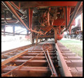
Underneathby SoulComment by smudgeSMJ: Overexposure is the first thing I notice here. I don't think the composition, frame, or subject matter really make up for it either. Kind of dull imho. |
| 04/21/2009 09:27:52 AM |
|
| 04/20/2009 07:47:42 PM |
|
| 04/19/2009 07:31:24 AM |
Underneathby SoulComment by ELLIPS: Interesting point of view - a pity that the background is overexposed |
| 04/18/2009 07:20:13 AM |
Underneathby SoulComment by SaraR: This is a really good concept, but let down in it's execution by the over-exposure to the left . The composition is good, and careful thought has clearly gone into it with the placement of the various lead-in lines. |
 Photographer found comment helpful. Photographer found comment helpful. |
| 04/17/2009 10:15:06 PM |
Underneathby SoulComment by Teafran: A little better lighting control reducing the highlights would have been a plus. Not an overly interesting image from an artistic sense, it does provide a lot of detail and color differences. A little more thought into the composition would have made for a better image. A good entry into the challenge, it falls just short of being truly effective. Perhaps a little change in viewing angle would have helped. |
| Photographer found comment helpful. |
| 04/15/2009 02:47:22 AM |
|
| 04/14/2009 06:46:56 PM |
Floralby SoulComment by Sheryll: This isn't a very interesting shot to me. The only portion is focus is the top left corner. It is flat middle grey tones and not much shown for texture. Although I know you tried. Maybe try reshooting with some added light, better focus more toward the front of the shot and perhaps a lower angle. |
| 04/12/2009 06:21:04 AM |
Floralby SoulComment by steve100: a 2 sorry , picture does not hold my attention and has little detail |
Home -
Challenges -
Community -
League -
Photos -
Cameras -
Lenses -
Learn -
Help -
Terms of Use -
Privacy -
Top ^
DPChallenge, and website content and design, Copyright © 2001-2025 Challenging Technologies, LLC.
All digital photo copyrights belong to the photographers and may not be used without permission.
Current Server Time: 04/18/2025 12:49:02 PM EDT.