| Image |
Comment |
| 11/19/2003 06:53:56 PM |
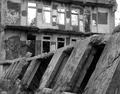
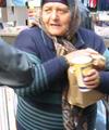
Gracefully Insane- The rise and fall of America's premier mental hospitalby mighty_bisonComment: Hey all,
Thanks for the input. Glad ya'll liked the photo.
I aslo think "blindjustice's" comment about the whole scene promoting a sense of ease is correct. A little more tension, perhaps by having used a monochromatic coloring?, would have helped my scoring a little bit. I also think a better book title would have given a little more insight as to what the photo was about. But, as of yet, none of our local talent has challenged the subject of Dr. Waughop's little hospital. |
| 11/15/2003 01:40:35 PM |
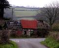
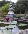
Great Expectationsby adeywilliamsComment: I think this photo would have been really great if you had done two things- angled your lense up and to the right and from a lower perspective. This would have eliminated the distracting road and telephone pole and created an almost diagonal foreground and given the photo an amazing amount of depth. Hope this critique helps. |
 Photographer found comment helpful. Photographer found comment helpful. |
| 11/15/2003 01:23:44 PM |
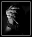
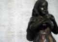
Of Human Bondage - W. Somerset Maughamby NatatorComment: Creative entry. It certainly is a contender in my opinion. I would have liked to have seen a lighter colored rope though. The long dirty fingernails are also distracting. |
| Photographer found comment helpful. |
| 11/15/2003 01:14:47 PM |
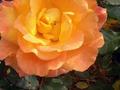
Success with ROSESby Crafty SueComment: The color and detail of the subject is great. I would have like to have seen the top portion of the rose in the photo though. I also would have liked to have seen the background either lightened or blurred........,or both. |
| Photographer found comment helpful. |
| 11/15/2003 12:44:08 PM |
|
| 11/15/2003 12:40:12 PM |
|
| Photographer found comment helpful. |
| 11/12/2003 09:08:15 PM |
|
| Photographer found comment helpful. |
| 11/12/2003 09:05:57 PM |
|
| Photographer found comment helpful. |
| 11/12/2003 08:55:20 PM |
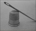
"Eye of the Needle" by Ken Folletby natorComment: I like the composition, though I'd like to have seen a little more reflection from these metal objects. Also you might have wanted to crop a little off of the right. the curve of the neddle is a little distracting. |
| Photographer found comment helpful. |
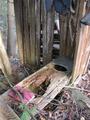
| 11/12/2003 08:49:51 PM |
The outhouse reader: more cowboy poetryby BotKeeperComment: I think that if you'd taken the photo from up higher it'd have helped reduced the background clutter. I think the the book should be closer to the "functional" seat,and a fill flash used to brighten up the shaded area. Hope this helps. |
| Photographer found comment helpful. |
Home -
Challenges -
Community -
League -
Photos -
Cameras -
Lenses -
Learn -
Help -
Terms of Use -
Privacy -
Top ^
DPChallenge, and website content and design, Copyright © 2001-2025 Challenging Technologies, LLC.
All digital photo copyrights belong to the photographers and may not be used without permission.
Current Server Time: 03/12/2025 12:07:35 PM EDT.